
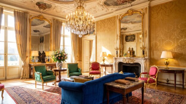
The colours of the Baroque are not a matter of taste, but a matter of attitude. Red stands for power and passion, green for wealth and nature, blue for heaven and nobility. Those who unite these three colours in a room create not arbitrariness, but hierarchy. Each colour claims its place, each carries a story. The room becomes a stage on which fabrics, wood and gilding enter into dialogue with one another.
The art lies not in showing all three colours simultaneously, but in distributing them so that the room can breathe. A deep ruby red on the wall, an emerald green velvet cover, a cobalt blue accent in the upholstery: these are not coincidences, but deliberate choices. Those who combine Baroque colours need courage for clarity and a sense of proportion. For what works in a palace can feel oppressive in a living space if one does not know the rules.
Red as the Leading Colour: Warmth with Weight
Red dominates the room, whether one wants it to or not. It draws the eye, it heats up the atmosphere, it demands resistance. In the Baroque period, red was chosen for throne rooms and audience chambers because it radiated authority. Today it works in rooms that should unite intimacy and presence: dining rooms, libraries, salons. The choice of red tone determines the effect. An oxblood red appears heavy and serious, a carmine red luminous and lively, a bordeaux muted and elegant.
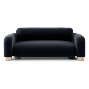
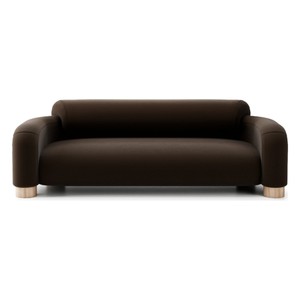
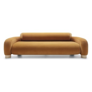
Red needs dark wood as a partner. Walnut, mahogany or stained oak give red stability and prevent it from tipping into shrillness. Gilding sets accents without breaking the warmth. Those who choose Sofas in red should keep the wall in broken white or a light grey tone, so that the furniture does not merge with the room. Casa Padrino shows how a ruby red velvet sofa with golden feet becomes the gravitational centre of a salon without overwhelming the room.
From the Casa Padrino collection
Green as Counterpoint: Calm and Wealth
Green is the colour that grounds red. It brings coolness into the heat, nature into the splendour. In the Baroque period, green stood for prosperity, because green pigments were expensive and difficult to produce. A rich emerald green or a dark moss green gives the room depth without weighing it down. Green works as a wall colour in rooms with high ceilings and large windows, but also as upholstery fabric for seating furniture that should not stand in the foreground.
The combination of green and red requires a buffer. Gold is this buffer. Gilded frames, candelabras or table legs create distance between the two strong colours and allow them to coexist without cancelling each other out. A green velvet fabric on an Armchairs does not appear as a contradiction next to a red sofa, but as a deliberate choice, when both pieces of furniture are connected by golden details. Casa Padrino relies on this balance and shows how green as a calm counterpoint to red structures the room.
Blue as Accent: Coolness and Distance
Blue is the most restrained of the three Baroque colours, but not the weakest. It brings coolness and expanse into the room, it opens the perspective. Cobalt blue, Prussian blue or a dark midnight blue work as accent colours, not as surface colours. Blue is used where one wants to direct the gaze: in the upholstery of a chair, in a wall panel, in a carpet. It is the colour that holds red and green together, because it competes with neither one nor the other.
Blue goes better with silver than with gold. Where red and green demand warm metal tones, blue needs the coolness of chrome-plated or silver-plated surfaces. A blue velvet cover on a chair with silver feet appears elegant and distanced, without being cold. Those who choose Chairs in blue should use them sparingly: two chairs at an otherwise red-green dominated table are sufficient to complete the composition.
Proportions and Distribution: Who Dominates the Room
The three Baroque colours only work when their proportions are clearly distributed. One colour leads, a second supports, the third accentuates. A room in which red, green and blue occur in equal parts appears indecisive. The classic rule states: 60 per cent main colour, 30 per cent accompanying colour, 10 per cent accent. Red can be the main colour when the room needs warmth and presence. Green takes the lead in rooms that should promote calm and concentration. Blue almost always remains an accent.
The distribution occurs through walls, furniture and textiles. A red wall demands green or blue furniture, a green wall tone requires red or blue accents. Those who are uncertain choose neutral walls and set the colours through upholstered furniture, curtains and carpets. Casa Padrino offers furniture that already considers this colour distribution: a red sofa with golden details, a green armchair with carved legs, a blue chair with silver fittings. The furniture carries the colour, the room gives them the frame.
Materials and Surfaces: Velvet, Silk, Wood
Baroque colours need materials that refract light and create depth. Velvet is the classic fabric for red and green, because it makes the colour appear lighter or darker depending on the incidence of light. Silk works for blue, because it enhances shine and coolness. Wood should be dark: walnut, mahogany, ebony. Light woods such as birch or maple do not suit the colour world of the Baroque, they take the weight from the colours.
Gilding is not decoration, but structure. It connects the colours, it creates transitions, it sets points of light. A gilded frame around a mirror, gilded feet on a table, gilded fittings on a chest of drawers: these are the details that distinguish a Baroque room from a mere colour combination. Casa Padrino understands these details and applies them consistently, without falling into overload.
Light and Shadow: How Colours Live
Baroque colours change with the light. A ruby red that glows in daylight becomes dark and mysterious by candlelight. An emerald green that shines in the sun appears muted and restrained under artificial light. Those who work with these colours must consider the light. Direct lighting makes red appear aggressive, indirect lighting makes it warm and inviting. Green needs soft light to avoid tipping into yellowish tones. Blue tolerates cool light without losing its elegance.
- Combine red with warm white light to avoid harshness
- Illuminate green with diffuse light to create depth
- Accentuate blue with cool white light to preserve clarity
- Spotlight gilding with targeted spots to set highlights
- Use candles and chandeliers to create the historical lighting atmosphere
What Carries the Room: Clarity Instead of Abundance
The classic Baroque colours work not through quantity, but through precision. Red, green and blue need space to take effect, they need dark wood to find stability, and they need gold or silver to speak with one another. Those who combine these colours create not decoration, but architecture. The room becomes a total work of art, in which each colour knows and fulfils its task. Casa Padrino delivers the furniture that can carry this task: with presence, with craftsmanship, with the naturalness that constitutes genuine Baroque culture.
Related categories: Fountains and Water Columns, Coffee Tables, Decorations. The full range: Baroque Furniture.