Category Archives: English

Christmas in the Palace: Festive Interiors with Baroque Furniture

Christmas in the Palace: Festive Interiors with Baroque Furniture

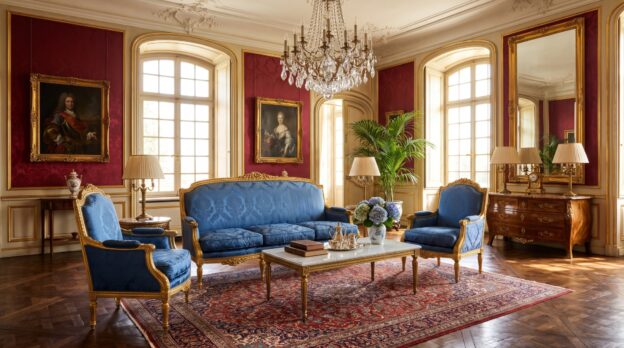
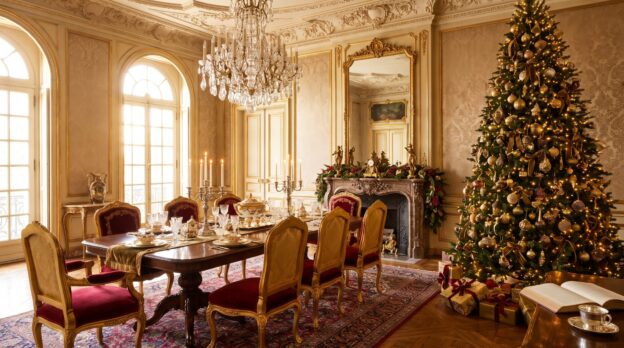
When dusk falls early and candlelight shimmers through tall windows, a room furnished with baroque pieces unfolds its full theatricality. The curved lines of gilded consoles, the velvet upholstery of seating furniture, the carved ornaments on mirrors and commodes: all of this becomes the backdrop for a celebration that promises splendour and intimacy alike during the Advent season. Christmas in the palace does not mean kitsch, but controlled opulence, where every element knows its place.

The challenge lies in not overloading the already lavish formal language of the baroque, but rather enhancing it through targeted accents. Red and gold are the classic colours, yet they require counterparts: dark fir green, matte silver, the warm white of beeswax. Velvet and silk reflect light differently than wood and metal, and precisely this layering of surfaces brings a festively decorated room to life. Casa Padrino understands this balance between historical form and contemporary staging.

The Table as the Centre of Staging

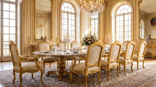
At the heart of Christmas interior design stands the set table. A baroque dining table with turned legs and a top of dark walnut or mahogany forms the foundation. The proportions are generous, the tablecloth of heavy linen or damask falls in long panels. Here the decoration may become lavish: tall candelabras of bronze or gilded brass, arrangements of fir branches, pomegranates and dried orange slices, accompanied by porcelain with gold rims and heavy cutlery. The Dining Tables from Casa Padrino offer the necessary presence to carry such staging without receding into the background themselves.

Symmetry is important: candelabras and arrangements should be arranged in mirrored fashion, a central element, such as a low bouquet of dark red roses and eucalyptus, sets the focal point. The height of the candelabras varies to create dynamism, yet the overall composition remains balanced. Glasses and plates are not distributed arbitrarily, but follow a clear order that guides the guest.

From the Casa Padrino collection
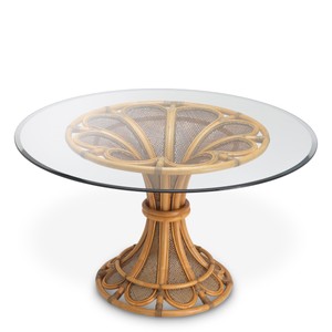
Luxury Dining Table Colony Rattan Honey Ø 130 x H. 76 cm

Seating Furniture Between Comfort and Ceremony

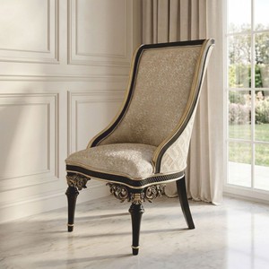
The choice of chairs determines the character of the table. Baroque chairs with high backrests, carved volutes and upholstery of velvet or brocade lend the meal a ceremonial note. The colour of the covering can take up the red of the decoration or set a contrast: deep blue, emerald green or a warm golden brown. Those who combine different Chairs, such as armchairs at the head ends and simpler models on the long sides, create hierarchy and variety at once.

The upholstery should be firm enough to provide posture, but soft enough to remain comfortable over several courses. A detail that is often overlooked: the height of the seat must match the table height, otherwise the entire arrangement appears awkward. Casa Padrino pays attention to these proportions, so that table and chair form a unity.

Setting Light and Shadow Deliberately

Baroque furniture lives from the interplay between light and shadow. Gilded carvings, polished veneers and mirrors reflect candlelight and make the room flicker. During the Christmas season, lighting should be deliberately reduced: no floor lamps, no cold LED spots, but candles at various heights, supplemented by individual table lamps with silk shades.

Wall sconces of gilded metal or crystal intensify the effect by throwing light back into the room. Mirrors with carved frames double the light sources and create depth. It is important that the lighting is not evenly distributed, but forms islands: the dining table is brightly lit, the corners remain in gentle semi-darkness, a secretary or console is accentuated by a single candle.
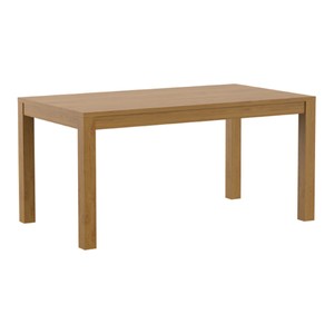
Dining Table Brown 160-220 x 90 x H. 75.5 cm

Textile Layers and Colour Harmonies

Velvet, silk, brocade: the fabrics of the baroque are heavy and lustrous, they absorb sounds and create an atmosphere of comfort. During the Christmas season, cushions, table runners and curtains in rich colours may be added. A dark red velvet runner on a golden console table, embroidered cushions on a chaise longue, heavy curtains in fir green that filter daylight and are drawn in the evening.

The colour palette remains limited: red, gold, green, with accents in silver or white. Too many colours disperse the effect. It is better to choose one main colour and use the others as companions. A room that relies on red and gold needs only a few green accents to avoid monotony. Casa Padrino offers furniture whose coverings and surfaces take up and intensify these colour harmonies.

Decorative Accents Without Overload

The Decorations should emphasise the architecture of the furniture, not conceal it. On a baroque commode, a tall candelabra, a small fir arrangement and an antique porcelain bowl with golden nuts suffice. On a side table next to an armchair: a stack of old books, topped with a single candle in a brass holder. Less is more, as long as each element is of high quality and deliberately placed.

Christmas motifs may remain subtle: no plastic angels, no flashing fairy lights, but hand-carved wooden figures, wax ornaments, dried flowers. Nature provides the most beautiful materials: pine cones, moss, rose hips, cinnamon sticks. They bring fragrance and texture into the room without disturbing the formal language of the furniture. A large Advent wreath of fir and ivy, fitted with thick beeswax candles, can stand on a sideboard or in the centre of the dining table.
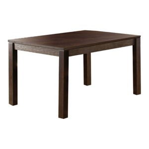
Dining Table Dark Brown 140-200 x 90 x H. 75.5 cm

Combination Rules for Harmonious Rooms

To prevent a room with baroque furniture from appearing overloaded during the Christmas season, clear rules help:

  • Preserve symmetry: arrange candelabras, mirrors and decorative elements in pairs or mirrored.
  • Vary heights: candelabras, vases and arrangements at different heights create dynamism.
  • Mix materials: wood, metal, glass, fabric and natural materials should alternate, not accumulate.
  • Limit colours: maximum three main colours plus accents, otherwise the composition disintegrates.
  • Leave open spaces: not every surface must be decorated, emptiness is part of the staging.

These rules apply to all rooms, from the dining room to the living room to the entrance area. Casa Padrino offers furniture that, through its clear formal language and high-quality workmanship, enables such compositions without requiring additional interventions.

The Room as Total Work of Art

Christmas in the palace does not mean overloading a room, but enhancing its existing quality. Baroque furniture already brings ornament, colour and lustre, the festive decoration only intensifies these qualities. When candlelight glides over gilded carvings, when velvet and silk refract the light, when the scent of fir green and beeswax drifts through the air, an atmosphere emerges that connects tradition and present. The art lies in maintaining the balance between splendour and restraint, between ceremony and comfort. A room that finds this balance carries the celebration with dignity and warmth alike.

Related categories: Columns and Pedestals, Armchairs, Sideboards. The full range: Baroque Furniture.
Baroque Furniture in New Buildings: How to Achieve Deliberate Style Contrast

Baroque Furniture in New Buildings: How to Achieve Deliberate Style Contrast

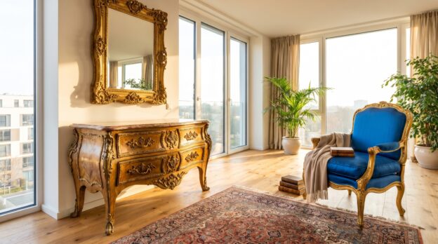
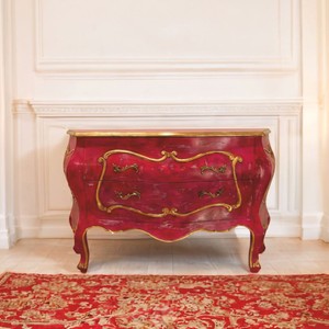
The walls are white, the windows frameless, the floor made of light oak concrete. A new building that promises light and spaciousness, clean lines and architecture that does not impose itself. And then there stands a chest of drawers with curved legs, gilded carvings and a marble top that reflects the daylight in warm glimmers. What appears at first glance to be a misunderstanding is, upon closer inspection, a dialogue that creates tension and gives the room depth.

Baroque furniture in new buildings works not despite the contrast, but because of it. It breaks the cool restraint of modern architecture and sets accents that emotionally charge the space. The prerequisite is that the stylistic break is consciously staged: with a sense of proportion, clear rules and an instinct for when a piece of furniture becomes a statement and when it overloads the room.

Why Baroque and New Buildings Complement Each Other

Modern architecture thrives on reduction. Smooth surfaces, right angles, a colour palette limited to white, grey and concrete. This creates calm, but can also appear sterile. Baroque furniture brings precisely what this aesthetic lacks: ornamentation, craftsmanship, history. A baroque console with its curved volutes or a mirror with a gilded frame sets a counterpoint that does not disturb the room, but completes it. The clear architecture becomes the frame, the baroque piece the picture.

From the Casa Padrino collection

Luxury Baroque Chest of Drawers with 2 Drawers Red / Gold 135 cm

The Right Measure: Less Is the Key

A stylistic break only works if it remains measured. Anyone furnishing a new building with baroque furniture should limit themselves to a few, distinctive pieces. A single Armchairs with embroidered velvet and turned legs can become an eye-catcher in a minimalist living room without tipping the spatial effect. What matters is that the furniture has space around it. In an open floor plan, typical of new buildings, a baroque piece needs air so that its form comes into its own. Too many ornaments in a confined space create restlessness, whereas a single object gains presence.

Materials That Build Bridges

The contrast between old and new becomes bearable when materials mediate. Marble, brass, dark wood or velvet are surfaces that appear in both baroque and contemporary interiors. A baroque console made of walnut with brass inlays harmonises with a modern kitchen if brass also appears on the fittings or handles. Colour can also connect: an armchair in deep blue or emerald green finds connection when the same tone recurs in cushions, curtains or a rug. At Casa Padrino, you will find baroque furniture that is so flexible in its colouring and choice of materials that it fits into a wide variety of spatial concepts.

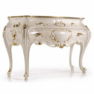
Luxury Baroque Chest of Drawers with 2 Drawers Cream White / Gold 144 cm

Where Baroque Furniture Finds Its Place in New Buildings

Not every room tolerates the stylistic break equally well. In the entrance area, a magnificent chest of drawers with a marble top and gilded fittings can set the tone without competing with other furniture. It stands alone, welcomes, gives the room weight. In the living room, a baroque coffee table or a large Mirrors above the sofa works, provided the rest of the furnishings remain restrained. In the bedroom, a bed with a high, carved headboard can dominate the room, while bedside tables and wardrobes are kept simple. What matters is that the baroque furniture does not disappear into a corner, but occupies a central position.

Concrete Combinations That Work

Anyone unsure how to combine baroque and modern styles can follow proven patterns. The following combinations create balance:

  • A baroque velvet armchair next to a simple side table made of metal and glass.
  • An opulent chest of drawers beneath a large-format, abstract painting in black and white.
  • A gilded wall mirror above a minimalist oak sideboard.
  • A baroque bed with white bedding and a modern reading lamp made of matt steel.
  • A baroque console in the hallway, with a contemporary sculpture or simple vase on top.
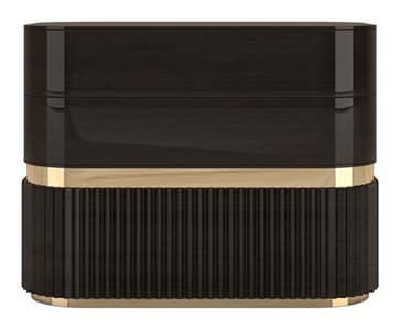
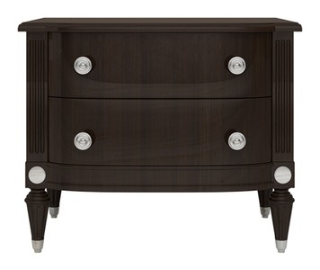
Luxury Art Deco Nightstand Dark Brown / Silver 70 x 45 x H. 55 cm

Consider Light and Proportions

Baroque furniture is often dark, solid, with much ornamentation. In a new building with large windows and high ceilings, this is not a problem, quite the contrary: daylight makes gilding shine and brings carvings to life. In smaller rooms or with low ceilings, one should be more cautious. Here, furniture with lighter woods or those that are more compact in proportion are recommended. Ceiling height also plays a role: a baroque piece of furniture with much vertical articulation, such as a tall cupboard or a mirror with an expansive frame, needs ceiling height to avoid appearing squat.

Colour as Mediator or Amplifier

Anyone wanting to sharpen the contrast leaves the walls white and opts for dark, richly decorated furniture. Anyone wanting to soften it works with wall colours in muted tones: taupe, greige, a warm grey. These colours take away the theatricality of the baroque furniture without diminishing its effect. Commodes in white or cream with golden accents also integrate more gently than dark walnut or mahogany variants. What matters is that the room’s colouring does not contradict the furniture, but frames it.

What Carries the Room

Baroque furniture in new buildings is not a contradiction, but an enrichment when chosen and placed with care. The stylistic break succeeds when a few strong pieces stand in a clear, restrained environment, when materials and colours build bridges and when the room allows enough air for the ornamentation to breathe. Casa Padrino offers a selection of baroque furniture that is of such high quality and craftsmanship that it holds its own even in modern surroundings. What remains is an interior that does not shy away from contrasts, but uses them to create rooms with character and depth.

Related categories: Baroque and Art Nouveau Garden Furniture, Consoles, Columns and Pedestals. The full range: Baroque Furniture.
Luxury terrace: garden furniture that looks like a grand hotel

Luxury terrace: garden furniture that looks like a grand hotel

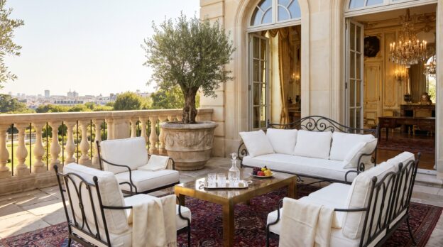
The terrace of a grand hotel follows a clear grammar: furniture in classical proportions, materials that tolerate patina, and a restraint that leaves room for conversation and views. Nothing cries out for attention, nothing seems arbitrary. Instead, a composition of metal, stone and wood that subordinates itself to the garden whilst simultaneously framing it. Those who wish to bring this atmosphere to their own terrace need not square metres like a resort, but rather a sense for material, proportion and the right dose of restraint.

The difference between a terrace and an outdoor hotel lounge rarely lies in size, but often in consistency. Grand hotels rely on furniture that still looks good after years, on surfaces that withstand weather, and on a colour palette that does not change with every season. Casa Padrino translates this attitude into collections oriented towards historical models: wrought iron chairs with filigree backrests, tables with stone tops, benches made of solid teak. The result is a terrace that does not appear decorated, but furnished.

Wrought iron and marble: the classic pairing

If Garden Furniture is to evoke a southern French château, there is scarcely a way around wrought iron. The material ages with dignity, develops a matte patina and harmonises with almost any environment. The workmanship is decisive: legs and struts should be slender but not thin, connections cleanly welded or riveted. Backrests may be ornamental, as long as the ornamentation follows a recognisable pattern and does not proliferate wildly. A round table with a marble top, surrounded by four chairs with curved armrests, is often sufficient to set the tone.

Marble brings coolness and weight, two properties that are welcome in summer. Carrara or travertine suit light iron, darker varieties such as Nero Marquina suit anthracite-coloured frames. Important: the top should be thick enough not to appear fragile, at least three centimetres. Those who shy away from marble choose granite or slate, both equally durable but more matte in appearance.

From the Casa Padrino collection

Luxury Art Nouveau Sofa White 435 cm

Teak: the quiet classic

Teak is the material that grand hotels have been using on pool terraces and roof gardens for decades. It does not rot, hardly warps and develops over time a silver-grey surface that looks more distinguished than any paint. Casa Padrino offers teak furniture in clear, reduced forms: loungers with flat profiles, armchairs with wide armrests, benches without flourishes. The proportions are generous but not bulky, the seat height low enough to signal relaxation, high enough to stand up comfortably.

Teak harmonises well with textiles in natural colours: linen in beige, sand or grey, possibly a dark navy blue as an accent. Cushions should be firmly stuffed and have clear edges, not soft, overflowing forms. Those who dislike the silver patina can oil teak, but that means maintenance. Most grand hotels simply let the wood age.

Planters as architecture

Large Flower Pots are not decoration on hotel terraces, but room dividers. They structure surfaces, create privacy screens and set vertical accents. Volume is decisive: a planter should hold at least fifty litres, preferably more, so that the plant within gains weight. Terracotta works in Mediterranean settings but weathers quickly. Zinc or galvanised metal remains neutral, suits cool colour palettes and is easy to combine. Stoneware in dark glazes, anthracite or black, appears modern and restrained at once.

The planting follows a simple rule: better few varieties in repetition than a colourful jumble. Box, lavender, grasses or olive trees suffice. Height is important: plants should exceed the planter by at least one and a half times, otherwise the composition appears squat.

Luxury Lounger Grey 168 x 56 x H. 91 cm

Lighting: indirect and ground-level

Grand hotels never illuminate terraces from above, but rely on floor lights, lanterns and indirect sources. Candles in hurricane lamps made of glass or metal, oil lamps on tables, LED spotlights that illuminate planters from below. The light should create atmosphere, not illuminate. Those who use electric lights choose warm white light and dimmable models. String lights are permitted if they run discreetly and do not flash.

Lanterns should be simple: clear lines, matte metal, no frills. They stand on the floor, on side tables or hang from hooks set into the wall. It is important that they do not obstruct and that the light remains soft. Too many light sources destroy the calm, three to five suffice for a terrace of twenty square metres.

Textiles: linen, no patterns

Fabrics on the terrace should be robust and dry quickly. Linen fulfils both criteria and looks like interior design. Tablecloths, napkins, cushion covers: everything in muted tones, preferably in one colour family. Stripes are permitted if they are narrow and low in contrast. Floral patterns, checks or bright colours do not suit an aesthetic designed for permanence.

Throws made of cotton or linen lie over chair backs or on loungers, within reach for cooler evenings. They should be large enough to wrap oneself in and heavy enough not to blow away with every gust of wind. Here too: better two or three high-quality pieces than a whole stack of thin blankets.

Luxury Relaxation Lounger Black 164 cm

Accessories: less is the rule

The right Garden Decoration makes the difference between a furnished terrace and a storage area with furniture. But grand hotels rely on reduction: a brass tray for glasses, a stone bowl for fruit, perhaps a sculpture if the space calls for it. No garlands, no signs, no decorative objects that loudly proclaim their function.

Casa Padrino offers accessories that are functional whilst looking good: trays, hurricane lamps, small side tables made of metal that can be moved. Everything in materials that withstand weather. It is important that each piece has a place and that nothing stands around because one does not know where to put it.

The composition: symmetry and open spaces

A hotel terrace never appears cluttered. Furniture stands in groups, with space in between. Symmetry helps create order: two armchairs left and right of a table, planters in pairs at the edges. But symmetry must not become rigid. A single chair, slightly apart, a bench standing crosswise: such deviations enliven the composition without destroying it.

  • Group furniture in odd numbers: three chairs around a table, five planters along a wall.
  • Repeat materials: if iron, then consistently. If teak, then not just one chair.
  • Limit colours to three: grey, white, green suffices. Or beige, anthracite, terracotta.
  • Create levels: tall plants, medium furniture, low lights.

What sustains the terrace

A terrace that evokes a grand hotel lives from three things: material that ages without deteriorating, proportions that radiate calm, and a restraint that leaves space. Wrought iron, marble, teak, linen: these are not fashionable decisions but investments in an aesthetic that endures over years. Casa Padrino understands this logic and translates it into collections that need not be reinvented every season. Those who furnish their terrace according to these principles create not a showroom but a place where one wishes to remain.

Related categories: Fountains and Water Columns, Coffee Tables, Decorations. The full range: Baroque Furniture.
The Dressing Room: Mirrors, Chests of Drawers and Armchairs for the Morning

The Dressing Room: Mirrors, Chests of Drawers and Armchairs for the Morning

The first light falls through tall windows, grazing oiled wood and polished brass handles. The space between bedroom and bathroom belongs to transition: here the day is prepared, clothing is chosen, the gaze in the mirror adjusted. A dressing room is more than storage space. It is a stage for the morning, a place where order and aesthetics interlock.

Those who design this space need three elements that support each other: the mirror as anchor point, the chest of drawers as functional sculpture, the armchair as point of calm. Their combination determines whether the space is merely practical or whether it creates an atmosphere in which one likes to linger.

The Mirror as Spatial Axis

A large standing mirror or a wall-filling model with a frame of dark mahogany or matte brass defines the centre of the room. It doubles the light, opens up narrow floor plans and gives the morning routine a fixed reference point. The proportion is decisive: the frame should be no narrower than eight centimetres so that it has weight but does not appear obtrusive. At Casa Padrino you will find Mirrors with faceted glass or curved baroque frames that hold their own in classical interiors without becoming theatrical.

The placement follows a simple rule: the mirror stands opposite the window or offset to the side, so that daylight falls on the clothing, not directly into the face. Those who combine several mirrors work with different heights. A narrow full-length mirror next to a lower model on the chest of drawers creates depth without overloading the space.

From the Casa Padrino collection

Luxury Baroque Mirror Gold / Silver 119 cm

Chests of Drawers as Built Order

The chest of drawers in the dressing room is not a storage place for odds and ends. It is a piece of furniture with presence that accommodates jewellery, watches and accessories while itself appearing like an exhibit. Materials such as solid walnut, lacquered oak or surfaces with inlays bring calm to the space. The height is ideally between 85 and 95 centimetres, so that the work surface is comfortably accessible without having to bend down.

Those who opt for classical forms choose Commodes with three to five drawers, whose fronts are structured by discreet fittings of bronze or blackened iron. The depth is important: 45 to 50 centimetres are sufficient to create order without the furniture protruding into the room. A flat bowl of marble or a tray of leather on the surface gathers small items and prevents the surface from becoming a dumping zone.

The Armchair as Silent Companion

An armchair in the dressing room is not a luxury but a functional detail. It serves as storage for the next day’s clothing, as seating when putting on shoes, as a resting point when the morning becomes hectic. The form should be clear: a high backrest, armrests that are not too wide, a seat that is firmly upholstered but does not yield like a lounge chair.

Materials such as velvet in muted grey, taupe or dark green bring texture to the space without dominating in colour. Leather in cognac or black suits chests of drawers in dark wood and creates a connection between classical furniture language and contemporary reduction. At Casa Padrino there are Armchairs with curved legs in baroque style or simple models with brass feet that fit into various spatial concepts.

Luxury Baroque Wall Mirror Gold 135 x H. 180 cm

Light and Surfaces in Interplay

A dressing room needs several light sources. Ceiling lights alone are not sufficient, they cast shadows on face and clothing. Better are wall lights to the left and right of the mirror that distribute the light evenly. A table lamp on the chest of drawers sets accents and creates atmosphere when the room is used in the evening. The colour temperature should be between 2700 and 3000 Kelvin, warm enough for comfort, neutral enough to reproduce colours realistically.

Surfaces in the room follow a clear hierarchy: wood dominates, metal accentuates, textiles soften. A carpet of wool or sisal dampens steps and visually connects the furniture. Those who forgo high pile keep the space clear and facilitate moving heavy drawers or shifting the armchair.

Proportions and Distances

The arrangement of furniture follows simple rules that open the space rather than obstructing it:

  • Between chest of drawers and mirror at least 120 centimetres distance, so that one can move freely.
  • The armchair stands to the side, not centrally in front of the mirror, to keep the sight line clear.
  • Wall shelves or open clothing rails at a height of 180 to 200 centimetres use the vertical space without visually pressing down.
  • In colour, a maximum of three tones dominate: wood, an accent material such as brass or marble, a textile colour.

Those who maintain these distances create room to breathe. The dressing room does not become a cubicle but a place that suggests spaciousness, even when the square metreage is limited.

Luxury Baroque Wall Mirror Black / Gold 90 x H. 173 cm

Details That Make the Difference

Small additions lift the dressing room beyond pure function. A narrow console table behind the armchair accommodates a vase with fresh branches or a bowl for cufflinks. A framed print on the wall, not a poster but an etching or a black and white photograph, gives the room depth. Clothes hangers of wood or metal, chosen uniformly, create order in the wardrobe and appear as a quiet design element.

The insides of the drawers also deserve attention. Lined with felt or velvet, they protect delicate fabrics and convey a sense of care when opened. Casa Padrino offers furniture that does not understand such details as additions but as a natural part of thoughtful design.

A Room That Begins the Day

The dressing room lives from the balance between function and aesthetics. Mirrors, chests of drawers and armchairs are not interchangeable props but supporting elements that structure the space and give it character. Those who rely on clear proportions, high-quality materials and thoughtful lighting create a place that does not accelerate the morning but gives it space. A room in which order is not compulsion but relief.

Related categories: Baroque and Art Nouveau Garden Furniture, Consoles, Columns and Pedestals. The full range: Baroque Furniture.
Villas on the Rhine: Furnishing with a View of the Water

Villas on the Rhine: Furnishing with a View of the Water

The light above the Rhine changes with every hour of the day. In the morning, a silvery shimmer lies on the water, in the afternoon the waves are sharply defined, in the evening sky and river merge into a single blue surface. Those who live in a villa on the shore live with this spectacle. The architecture opens towards the water, tall windows frame the view, terraces extend over the slope. The interior must withstand this generosity without competing with the river.

The furnishing follows a clear logic: it submits to the view, guides it, frames it. Furniture becomes framing, materials take up the colours of the water, proportions create calm. Those who furnish here work with restraint and precision. The result is a space that breathes, that lets the landscape in whilst offering shelter.

The sightline determines the arrangement

In villas with a Rhine view, the window dictates the order. The seating group faces the water, not the fireplace or the cabinet. A long, low sofa stands parallel to the window front, two armchairs flank it at right angles. This creates an open formation that clears the view whilst still creating conversational proximity. The backrests remain low so that the silhouette of the furniture does not disturb the horizon line. Casa Padrino offers Sofas in classic proportions, whose upholstery remains firm enough to provide support, and whose covers in linen or matte velvet reflect the light softly.

Space remains between sofa and window. A narrow passage of one and a half metres suffices to reach the terrace without the furniture being in the way. This gap strengthens the connection to the outside, it lets the room breathe. Rugs mark the seating zone but end one metre before the windowsill so that the flooring continues and optically stretches the surface.

From the Casa Padrino collection

Luxury Sofa Light Grey 253 cm

Materials that mirror the water

The colour palette takes up the tones of the river: grey in all shades, from light limestone to dark slate, plus white, beige and occasionally a matte blue-grey. Wood appears in stained oak or walnut, the grain remains visible but not dominant. Marble and polished granite set cool accents without appearing cold, because they are used in large, calm surfaces.

Metal appears in bronze or burnished brass, never in high-gloss chrome. Lights, handles, table frames bear a matte patina reminiscent of ship fittings without becoming maritime. Glass remains clear or slightly smoke-coloured, vases and bowls in thick crystal refract the light without sparkling. The materials combine into a composition that has depth but does not become restless.

Furniture in clear lines and restrained forms

Beside the sofa stand Side Tables of solid wood or stone, whose tops are thick enough to show weight but not so massive that they burden the room. Round forms soften the severity of the architecture, rectangular tables emphasise the horizontal. A low coffee table of travertine or oiled oak holds books and a single bowl, nothing more. The surface remains clear so that the eye can wander to the window front.

Shelves and chests stand against the side walls, never in front of the window. Their fronts are smooth, handles discreet or completely integrated into the construction. Casa Padrino offers furniture that dispenses with ornament and instead convinces through proportion and craftsmanship. A sideboard of dark walnut with brass feet bears a lamp, a tray, a sculpture. This staging remains strictly curated, each object has its place and its justification.

Luxury Sofa Beige 253 cm

Light that accompanies the day

Daylight dominates, artificial light only emerges at dusk. Curtains of heavy linen or semi-transparent cotton muslin can be pushed aside when the sun is low, but remain open most of the time. Blinds of wood or metal regulate the brightness precisely without obstructing the view.

In the evening, floor lamps with adjustable shades and table lamps with conical shades take over the lighting. They stand where reading or working takes place, not in the centre of the room. Uplighters cast indirect light onto the walls, pendant lights above the dining table hang low enough to illuminate the table but not to disturb the view. The light colour remains warm to balance the cool materials without becoming yellowish.

Walls and floors as calm surfaces

Walls in matte white, light grey or sand-coloured lime plaster form the neutral background. Textured plaster or panelling of oiled wood bring depth without imposing themselves. Large Mirrors in narrow brass frames hang on the side walls and double the light reflected from the water. They never stand directly opposite the window, because otherwise the reflection overlays the view, but slightly offset to optically widen the room.

Floors of wide planks in oiled oak or large-format stone slabs run through all rooms facing the water. Joints remain narrow, transitions inconspicuous. Rugs in natural tones define zones, their texture remains flat so that they do not distract from the overall picture. A hand-knotted rug in grey and beige under the seating group, a runner of sisal in the hallway, nothing more is needed.

Luxury Sofa Taupe 253 cm

Rules for composition by the water

  • Furniture lower than 90 centimetres backrest height so that the window line remains clear.
  • Colour palette limited to five tones: grey, white, beige, wood, an accent in blue-grey or bronze.
  • No patterns on large surfaces, texture only through material and weave.
  • Distance between furniture and window front at least 1.20 metres.
  • Symmetry on the side walls, asymmetrical looseness in the centre of the room.
  • Artworks and objects in odd numbers, never in pairs.

Choosing accessories with consideration

Vases of thick glass or matte ceramic stand individually, filled with branches or a single bloom. Sculptures of bronze or stone find their place on consoles or windowsills, their forms abstract enough not to compete with the landscape. Books lie in small stacks, their bindings chosen in muted colours. Casa Padrino complements the range with such details that complete rooms without overloading them.

Textiles are limited to cushions in linen or wool, their colours tone in tone with the sofa or a shade darker. Blankets of cashmere or heavy cotton fabric lie over the armrest, ready for cool evenings. Crockery and glasses remain in cupboards until they are needed, the surfaces remain clear.

What sustains the room

A villa on the Rhine demands furnishing that holds back without becoming insignificant. Every piece of furniture, every colour, every material must justify its place. The view remains the protagonist, the furnishing its frame. Those who maintain this balance create rooms that offer expanse and shelter simultaneously, that live with the light and the water without being dependent on them. The result is an atmosphere of quiet elegance that does not appear staged but grown.

Related categories: Decorations, Dining Tables, Garden Furniture, Stoves and Decoration. The full range: Baroque Furniture.
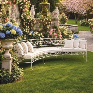
A Salon for Guests: Seating Groups That Make Conversation Easy

A Salon for Guests: Seating Groups That Make Conversation Easy

A salon thrives on encounter. Not on passage, not on television, but on that moment when four, six or eight people sit facing each other and conversation finds its own rhythm. This requires more than comfortable upholstery: the furniture must create proximity without producing confinement, and maintain enough distance so that no one feels observed. When furnishing a room for guests, one plans not merely seating, but constellations.

The arrangement determines whether an evening succeeds or falters. A single sofa against the wall invites not dialogue, but escape. Only when seating surfaces open toward each other does that invisible circle emerge in which words fall easily. The salon follows its own laws, composed of proportion, material and distance. Those who know them furnish rooms in which guests wish to remain.

The Geometry of Encounter: How Furniture Finds Each Other

A classic seating group forms a U or an open circle. Two Armchairs flank a two- or three-seater sofa, between them lies a common centre, usually a low table. The distance between seat edges should lie between 180 and 240 centimetres: close enough for undisturbed conversation, far enough that no one feels pressed into the knees of their counterpart. Those who plan the space larger risk voices fading. Those who contain it more tightly create intimacy that not every guest seeks.

The symmetry need not be strict, but it should remain perceptible. Two identical armchairs create balance, a third element may deviate. A bergère with a high back beside a narrower club chair generates tension without breaking the order. What matters is that all seating surfaces lie at eye level: those who sit lower than others lose presence.

From the Casa Padrino collection

Luxury Sofa Light Grey 253 cm

Material and Colour: What Brings Calm to the Room

A salon tolerates contrasts, but not restlessness. Velvet, leather and linen may stand beside each other, as long as the colour palette remains closed. Three tones suffice: a dark ground, a middle accent, a light counterpoint. Anthracite, taupe and cream, for instance, or bottle green, cognac and ivory. Those who introduce more colours should hide them in cushions or throws, not in the large upholstered surfaces.

Leather ages visibly and gains character in the process. Velvet reflects light and gives every room depth. Linen remains cool, even in warm tones. The choice of material follows usage: a salon that is occupied daily requires robust covers. A reception room that lives only at weekends may be more delicate. Casa Padrino carries upholstered furniture that fulfils both demands without sacrificing bearing.

The Table in the Middle: Surface for Glasses, Books and Gestures

A Coffee Tables in the salon is not a storage surface, but an anchor. It holds the group together, offers surface for carafes, bowls and those books one likes to display. The height should lie just below the seat edge, between 40 and 45 centimetres. Those who build higher block the view. Those who go lower force guests to bend down.

The form follows the arrangement: before a straight sofa stands a rectangular table, in a U-shape a round or oval one. Marble, dark wood or metal with glass top, each material sets a different accent. Marble brings coolness and weight, wood warmth, glass lightness. A table may show presence, but it should not dominate. 120 centimetres in length suffice for most constellations, anything beyond becomes a barrier.

Luxury Sofa Beige 253 cm

Light and Shadow: How Luminaires Guide the Mood

A salon requires several light sources, never just one ceiling fixture. Floor lamps beside the armchairs, a table lamp on the console, perhaps a wall light above the fireplace. The light should be warm, between 2700 and 3000 Kelvin, and fall indirectly. Direct spots dazzle, diffuse light envelops. Dimmers allow the brightness to be adjusted to the time of day: brighter in the afternoon, more subdued after dinner.

Candles belong in every salon that wishes to be taken seriously. Not as decoration, but as a light source. Three, five or seven candles on the table, never an even number. They create that restlessness in light that electrical sources cannot generate. Those who choose candelabra in brass or silver-plated metal amplify the effect through reflection.

Rules for Arrangement: What Works, What Disturbs

  • All seats must be able to see each other without anyone having to turn their head.
  • The distance between sofa edge and table edge should be at least 40 centimetres, so that legs find space.
  • A rug beneath the seating group binds the furniture together. It should be large enough that all front legs stand upon it.
  • Side tables beside armchairs offer surface for glasses without overloading the coffee table.
  • Cushions and throws may lie loosely, but not overload. Three cushions per sofa, one per armchair suffice.
Luxury Sofa Taupe 253 cm

Proportions in the Room: How Much Furniture a Salon Tolerates

An overloaded salon loses generosity. The seating group should occupy no more than half the room’s surface. The rest remains free for movement, for the gaze, for that emptiness that first gives furniture its effect. Those who furnish a small room choose narrower Sofas with high legs. They create optical lightness because the floor remains visible.

High ceilings tolerate high backrests, low rooms require flatter proportions. A Chesterfield with deep capitonné buttons appears appropriate in a period building with four metres of height, crushing in a new build with 2.40 metres. Casa Padrino offers upholstered furniture in various scales that adapt to the architecture rather than working against it.

Details That Make the Difference: Consoles, Mirrors, Objects

A salon lives not only from the seating group. A console on the wall behind the sofa offers surface for lamps, vases or framed photographs. A mirror above doubles the light and opens the room. The console should be narrow, between 30 and 40 centimetres deep, so that it does not project into the room. Marble, dark wood or metal with gold finish, each material sets an accent that may repeat in other furniture.

Objects on the coffee table follow the rule of odd numbers: one bowl, three books, one vase. Never more than five elements, otherwise the surface becomes storage. A single sculptural object, a bronze figure or a glass bowl, can suffice if it has presence. The salon tolerates emptiness better than abundance.

What Carries the Room: Bearing Rather Than Effect

A successful salon shows not what is possible, but what is necessary. Each piece of furniture has its function, each colour its reason. The seating group opens toward the guests, the light falls softly, the proportions are correct. What remains is a room that does not force conversations, but makes them easy. Casa Padrino understands this demand and delivers furniture that does it justice: without noise, with substance.

Related categories: Columns and Pedestals, Sideboards, Sculptures. The full range: Baroque Furniture.
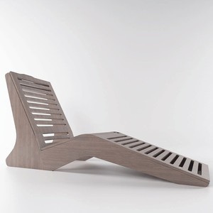
Columns and Pedestals: Architectural Elements That Structure Rooms

Columns and Pedestals: Architectural Elements That Structure Rooms

A tall room without structure often feels empty, even when furnished. Proportions blur, visual guidance is absent. Only when vertical elements structure the space does clarity emerge: columns set rhythm, pedestals elevate what should carry weight. What served a load-bearing function in classical architecture becomes a design instrument in contemporary interiors.

Working with such elements creates hierarchies. A pedestal beneath a bust or object defines a zone of attention. A freestanding column divides an open floor plan without closing it off. The interplay of height, material and placement determines whether a room can be read or remains diffuse.

Verticals as Ordering Principle

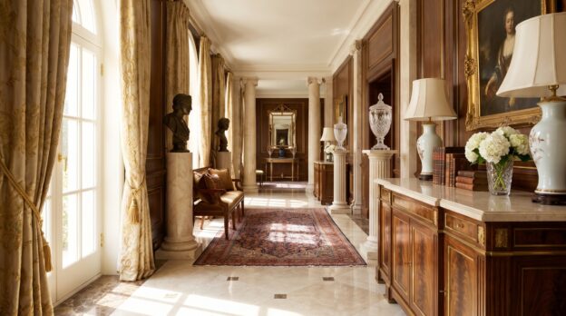
Columns structure rooms by establishing axes. In a loft with six-metre ceiling height, a single column of marble or cast iron marks the transition between living and dining areas without erecting a wall. Material determines effect: light Carrara reflects light and opens, dark granite or patinated metal densifies. The column becomes a vertical line that guides the eye upward and stretches the space. Casa Padrino offers Columns and Pedestals in various styles suitable for such spatial interventions.

From the Casa Padrino collection

Baroque Style Pedestal White Ø 47 x H. 58 cm

Pedestals as Stage for Objects

A pedestal lifts an object out of the spatial plane. An antique vase, contemporary ceramic or small bronze figure gains presence when standing on a defined platform. Pedestal height determines viewing level: a low pedestal of thirty centimetres integrates the object into the furniture plane, a tall one of ninety centimetres makes it a focal point upon entering the room. Material should serve the object, not compete. Plain white marble suits a coloured glass sculpture, whilst a reduced sculpture may take a pedestal of dark wood or stone with pronounced grain.

Material Choice and Proportion

A column’s effect depends on its diameter and surface. A slender column of twenty centimetres diameter appears elegant, almost graphic. A massive column of forty centimetres brings substance to the room but also demands corresponding ceiling height. For surfaces: polished marble reflects and cools, ground natural stone remains warm, brushed metal adds an industrial note. In a room with stucco and parquet, a classical fluted column harmonises; in a purist setting, a smooth stele of concrete or granite.

  • Light materials such as Carrara or travertine for light-flooded rooms with high ceilings
  • Dark stones such as Nero Marquina or basalt for contrasting accents in neutral interiors
  • Cast iron or bronze for historic rooms with stucco and panelled doors
  • Concrete or terrazzo for modern floor plans with exposed concrete and large window fronts
Cast Iron Column Black H. 286 cm

Placement and Spatial Effect

A column in the centre of a room divides without separating. It creates two zones that remain visually connected. In an elongated salon, a row of three columns can generate a rhythm that structures the room whilst holding it together. Distance matters: set too closely, columns act as a barrier; too far apart, they lose their structuring force. A distance of two to three metres permits views and movement. Those working with Sculptures can use pedestals as presentation surfaces, thus creating a connection between architecture and art.

Light and Shadow as Amplifiers

A column unfolds its full effect only through light. An uplight emphasises the vertical and makes fluting emerge plastically. Indirect light from the side models the surface and reveals the material’s structure. In a room with tall windows, daylight travels across the column and changes its appearance throughout the day. Polished surfaces create reflections that energise the room. Matte material absorbs light and appears calmer, more stable.

Cast Iron Column Black 134,5 x H. 270 cm

Combinations with Furniture and Accessories

Columns and pedestals do not function in isolation. They require a counterpart: a low table emphasising the horizontal, or a sideboard marking the floor line. A pedestal beside an armchair creates a surface whilst providing a vertical counterpoint. In a dining room, a column behind a buffet can stand and extend the composition upward. Casa Padrino carries matching Decorations that corresponds with such elements and supports the spatial concept.

Historical References in Contemporary Rooms

Classical column forms such as Ionic or Corinthian capitals bring history into modern floor plans. They function as quotation, opening a dialogue between epochs. In a penthouse with concrete ceiling, an antiquated marble column can generate tension without appearing kitschy, provided material and execution are of high quality. Dosage is decisive: a single column as statement works, an entire colonnade in a living space overloads. Those employing historical elements should combine them with contemporary furniture to avoid musealisation.

What Carries the Room

Columns and pedestals are not decoration in the narrow sense. They structure, organise and create hierarchies. A room with considered vertical elements has clarity without appearing rigid. Material choice follows spatial mood, placement follows function. Those employing these elements purposefully work with the means of architecture and create rooms that can be read.

Related categories: Consoles, Armchairs, Sideboards. The full range: Baroque Furniture.
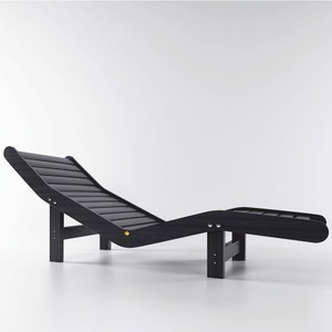
The Chest of Drawers as Work of Art: Marquetry, Marble and Gilded Fittings

The Chest of Drawers as Work of Art: Marquetry, Marble and Gilded Fittings

A chest of drawers rarely stands alone. It carries the room, catches the light, sets an accent that remains. When its surface consists of inlaid wood, when marble forms the top and gilded fittings frame the drawers, the piece of furniture becomes a work of art. Such pieces are not created on an assembly line. They demand craftsmanship, materials and time, and they demand a space that understands their presence.

Anyone who places such a chest of drawers makes a choice for more than storage space. They select an object that attracts glances, defines proportions and tells a story of skill and taste with every detail. In high rooms with stucco, in hallways with natural stone floors or in salons with subdued light, its effect unfolds without competition.

Marquetry: Geometry and Depth in the Surface

Marquetry work means that different woods are inlaid into the surface in such a way that patterns, ornaments or figurative motifs emerge. Walnut, ebony, maple, rosewood, each type of wood brings its own colour and grain. The result is a surface that does not appear flat, but suggests depth. Light and shadow play across the marquetry, the appearance changes depending on the time of day. Such a chest of drawers demands attention without being loud. It belongs in rooms that allow calm and where not every wall is hung with pictures. Here the piece of furniture can breathe, here it is read.

From the Casa Padrino collection

Luxury Art Deco Nightstand Dark Brown / Silver 70 x 45 x H. 55 cm

Marble as Top: Cool Elegance and Contrast

Marble on a chest of drawers is no coincidence. The material brings coolness, hardness and a visual weight that grounds the piece of furniture. Carrara marble with its white to grey veining, black Marquina with fine white lines or green marble with golden inclusions, each variety sets a different accent. The top forms a contrast to the warm wood beneath, it reflects light differently, it is cool to the touch. On it stand vases, candlesticks, small sculptures. Nothing may be too much. The marble demands discipline in staging. Anyone who places too much suffocates the effect. With Commodes with marble tops, reduction determines elegance.

Gilded Fittings: Capturing Light and Setting Accents

Gilding is not decoration, but function that becomes ornament. The fittings, handles, keyhole escutcheons, corner reinforcements, are made of bronze or brass and covered with gold leaf. They frame the drawers, they structure the front, they capture the light and throw it back. In a room with chandeliers or wall lights, a dialogue emerges between the gilded surfaces. The fittings must not be too dominant, but they must remain present. Their form often follows historical models: rocaille ornaments, acanthus leaves, geometric frames. They connect the piece of furniture with an era without imprisoning it there.

Luxury Art Deco Nightstand Dark Brown / Gold 70 x 45 x H. 55 cm

Proportions and Spatial Effect: Where the Piece of Furniture Stands

A chest of drawers with marquetry, marble and gilding needs space. Not necessarily much floor area, but air. It stands against a free wall, flanked by tall windows or between two doors. Above it ideally hangs a large mirror that doubles the proportions and opens the room. The chest of drawers itself should not be higher than 90 centimetres, so that it does not appear bulky. Its width may be generous, 120 to 180 centimetres are common. The depth remains moderate, 50 to 60 centimetres are sufficient. This creates a piece of furniture that is horizontally positioned, radiates calm and does not dominate the room but carries it. Matching Mirrors in gilded or plain frames reinforce the symmetry and allow the ensemble to grow together.

Combination Rules: What Can Coexist Beside the Chest of Drawers

A work of art tolerates no competition, but it needs accompaniment. Beside a richly decorated chest of drawers, furniture with clear lines works: a plain armchair with linen upholstery, a narrow side table of dark wood, a tall floor lamp with brass base. Colours should remain restrained. Grey, beige, dark green or deep blue form a frame that does not drown out the chest of drawers. Textiles may have texture, velvet, linen, heavy silk, but no loud patterns. On the marble top stand few, but precisely chosen objects:

  • A tall vase of crystal or matt glass, with or without branches
  • A pair of candlesticks of bronze or silver-plated metal
  • A small bowl of marble or onyx for keys or visiting cards
  • A narrow tray on which a decanter and glasses stand
  • A single book, leaning upright, with beautiful binding

Each of these elements must be able to stand on its own. Anyone who places too much transforms the chest of drawers into a shelf. High-quality Decorations made of noble materials underlines the character of the piece of furniture without overloading it.

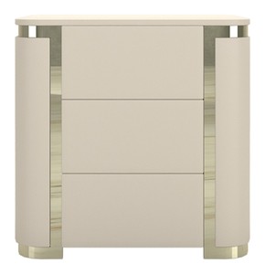
Luxury Art Deco Nightstand Cream / Gold 60 x 45 x H. 55 cm

Care and Patina: How the Material Ages

Marquetry, marble and gilding are durable, but not indestructible. Wood reacts to humidity, marble is sensitive to acid, gilding can tarnish. Regular dusting with a soft cloth is usually sufficient. Wooden surfaces are occasionally treated with special furniture oil, marble wiped with a damp cloth, never with harsh cleaners. Gilded fittings must not be polished, otherwise the gold leaf dissolves. A light patina is not a flaw, but a sign of lived time. It gives the piece of furniture depth and authenticity. Anyone who owns such a chest of drawers does not only care for it, they accompany it.

What Carries the Room: The Chest of Drawers as Centre

A chest of drawers with marquetry, marble and gilded fittings is not a supporting actor. It organises the room, it sets the tone, it defines what may coexist beside it. In a hallway it receives, in a salon it forms the resting pole, in a bedroom it becomes quiet luxury. What is decisive is that the room does it justice: high ceilings, good light, clear lines. Anyone who fulfils these conditions receives a piece of furniture that not only functions, but works. Casa Padrino understands this interplay and offers pieces that fit into such rooms without ingratiating themselves. The chest of drawers remains what it is: a work of art that carries.

Related categories: Garden Decoration, Garden Furniture, Baroque and Art Nouveau Garden Furniture. The full range: Baroque Furniture.
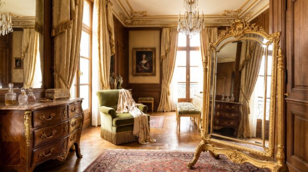
Water in the Garden: Fountains as the Focal Point of Terrace and Courtyard

Water in the Garden: Fountains as the Focal Point of Terrace and Courtyard

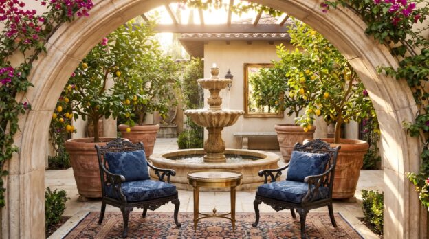
A courtyard of pale sandstone, a terrace between box hedges, or a square beneath old plane trees: where water falls, space becomes concentrated. A fountain sets a point around which paths, seating areas, and plantings arrange themselves. It gives the garden structure and transforms silence into sound. When placed correctly, it creates a place that cools in summer and retains presence in winter.

The effect does not arise from size alone. What matters are proportion, material, and the relationship to the surrounding space. A fountain made of natural stone integrates differently than a model in bronze or cast iron. The water movement determines whether the garden comes to rest or gains vitality. Those who understand these parameters can deploy the fountain so that it becomes a natural focal point.

Material and Form: How the Fountain Shapes Space

Natural stone in grey or beige integrates into classical garden architecture. Granite, sandstone, or travertine age with patina and appear as if they have always been there. Bronze develops a greenish oxide layer that emphasizes Mediterranean courtyards and formal gardens. Cast iron in black or dark green suits historic estates and townhouses with brick facades. Garden Fountains made from these materials carry the garden through decades without losing presence.

Form follows function: round basins with central water jets create symmetry and direct the gaze inward. Multi-tiered models with cascades structure space vertically and create depth. Wall fountains save space and suit narrow courtyards or terrace walls. The height of the fountain should match the surroundings: in a small courtyard, 80 to 120 centimeters suffice; on large terraces, 150 to 200 centimeters are appropriate.

Placement: Where Water Becomes the Centre

The fountain stands where sight lines intersect. In a square courtyard, it marks the centre, surrounded by gravel or paving. On a terrace, it moves to the edge or into a corner, so that seating surrounds it without blocking passage. In front of a hedge or wall, it gains depth because the dark green lifts the pale stone surface.

The distance to seating groups should be two to three meters. This keeps the sound of water present without drowning out conversation. Plants in pots or low beds frame the fountain without obscuring it. Boxwood, lavender, or grasses in grey and green create transitions between stone and vegetation. Casa Padrino offers Fountains and Water Columns in various scales that can be precisely matched to room size.

Water Movement: Sound and Rhythm in the Garden

A thin jet rising vertically from the centre and falling quietly into the basin creates calm monotony. Cascades running over several tiers bring movement and fill the space with layered rushing. Wall fountains with broad water curtains create an even backdrop that dampens background noise.

Volume can be regulated via pump output. In a quiet courtyard, a gentle flow audible only from close range suffices. On a terrace by a busy street, the water may fall more loudly to overlay external noise. The water surface reflects light and amplifies the effect of sunlight or outdoor lighting. In winter, when the pump is switched off, the sculpture remains as a resting point.

Combinations: Furniture and Decoration in Harmony

Teak furniture in warm brown harmonizes with stone fountains in beige or grey. Wrought iron chairs and tables suit cast iron and bronze. White garden furniture in aluminum or lacquered metal creates contrasts with dark fountains and establishes a light, modern atmosphere. Cushions remain restrained: linen in natural, grey, or blue-grey integrates into the color palette.

Additional elements from the Garden Decoration range reinforce the effect without competing. Lanterns in iron or brass flank the fountain and set accents in the evening. Planters in the same material language create repetition and order. Sculptures or obelisks stand at sufficient distance so that the fountain retains its central role. Casa Padrino carries collections that are coordinated with one another and enable coherent design.

Technical Details: Function Without Effort

The pump operates in a closed circuit and requires only an electrical connection. Water circulates through filters that retain leaves and debris. An overflow protection prevents the basin from overflowing in rain. In autumn, the pump is removed, the water drained, and the basin covered with a tarpaulin. Frost-resistant materials such as granite or cast iron survive winter without damage.

Installation requires a stable foundation of concrete or compacted gravel so that the fountain does not subside. An electrician lays the cable underground and secures it with a residual current circuit breaker. Commissioning takes a few hours; afterwards, the system runs with low maintenance throughout the entire season.

Light and Season: Staging Throughout the Year

During the day, natural light suffices to make the water surface gleam. In the evening, ground spots or underwater spotlights stage the fountain. Warm white light emphasizes the structure of the stone without distorting the atmosphere. LED technology saves energy and allows control via timers.

In spring, fresh perennials surround the fountain; in summer, the water noticeably cools the air. In autumn, dark foliage contrasts with pale stone; in winter, the sculpture becomes a resting focal point among bare branches. Those who leave the fountain visible year-round create continuity and prevent the garden from losing its centre in winter.

Proportions and Scale: Size in Relation to Space

A fountain with an 80-centimeter diameter suits a terrace of 15 square meters. At 30 square meters, 120 to 150 centimeters are appropriate. In large courtyards or park gardens, models with two meters diameter carry the space without disappearing. Height should not exceed one and a half times the diameter, otherwise the fountain appears unstable.

  • Small courtyards: wall fountains or single-tier models up to 100 centimeters high
  • Medium terraces: round fountains with 120 to 150 centimeters diameter, two to three tiers
  • Large gardens: multi-tiered cascades from 180 centimeters high, freestanding in the centre
  • Narrow passages: wall fountains with flat relief, 60 to 80 centimeters wide

Why the Fountain Carries the Garden

A fountain orders outdoor space without dominating it. It creates a point that attracts gazes and brings movement into stillness. Material, form, and placement determine whether it integrates or remains foreign. Those who pay attention to proportions and relate the fountain to furniture and plants gain a focal point that carries through years. Water cools in summer, stone remains in winter. Thus the terrace or courtyard becomes a place that has its centre in every season.

Related categories: Decorations, Dining Tables, Garden Furniture, Stoves and Decoration. The full range: Baroque Furniture.
Baroque Chairs: Why the Right Chair Ennobles the Dining Table

Baroque Chairs: Why the Right Chair Ennobles the Dining Table

A dining table made of dark wood stands in the room, its surface catching the light from the windows, its edges cleanly drawn. Yet only when the chairs find their place does it become clear whether the room breathes or stiffens. A baroque chair with a curved backrest, gilded carvings and a velvet seat transforms the table into a stage. It brings weight, posture and a gesture that goes beyond mere sitting. The chair is not an accessory, it is the silent partner that lends the table its dignity.

Anyone who owns a representative dining table knows about the tension between surface and surrounding space. The table needs framing, and this is created not through quantity but through form. Baroque chairs set accents that guide the eye: upward, to the backrest, to the legs, back to the centre. They create rhythm and make the room appear larger because they structure it. The question remains which chairs suit which table and how much ornamentation a room can bear without losing its clarity.

The Backrest as an Architectural Element

The backrest of a baroque chair is more than a support. It stands vertically in the room, often over a metre high, forming a vertical line that frames the dining table. Carved volutes, acanthus leaves or rocailles set accents without overloading the silhouette. Proportion is decisive: a tall, narrow backrest stretches the room, a broader form with an expansive crown gives the table weight. Casa Padrino crafts chairs with backrests where the carving is positioned to work from a distance without being intrusive in detail. The eye follows the line, not the ornament.

From the Casa Padrino collection

Luxury Baroque Dining Chair Beige / Black / Gold H. 112 cm

Material and Surface in Dialogue with the Table

A dining table made of solid walnut or oak demands chairs that absorb its materiality without duplicating it. Beech or ash, stained in a dark tone, create continuity. Gilded accents on legs or rails break the heaviness and bring light into the composition. Velvet seats in burgundy, emerald or anthracite set colour points that do not compete with the table but complement it. Those who choose Dining Tables made of light wood or with a marble top can work with darker chairs to create contrast. The surface of the wood should be matt or satin matt, high gloss often appears too smooth next to baroque carving.

Number and Arrangement: Symmetry Without Rigidity

A rectangular table carries six to eight Chairs, depending on length. The spacing is decisive: 60 centimetres width per seat, so that the backrests do not stand too close together. At the head ends, armchairs can stand, giving the table framing without shortening it. Chairs without armrests placed at the sides keep the line open. Those who own a round table choose chairs with narrower backrests so that the circle does not break. Casa Padrino offers models whose legs are set slightly outward, which enlarges the base and simultaneously creates lightness. Symmetry arises through repetition, not through force.

Dining Chair with Armrests Light Grey / Natural H. 89 cm

Combination Rules for Baroque Chairs and Modern Tables

Baroque chairs also work alongside contemporary tables when the proportions are right. A simple table with a steel frame or clear wooden top gains depth through ornamented chairs without appearing historical. Several principles apply that control the break:

  • The seat height must match the table top: 45 centimetres seat height at 75 centimetres table height is standard.
  • Colour contrasts sharpen the effect: dark chairs with a light table, gilded details with matt metal.
  • Maximum two materials in the chair: wood and fabric or wood and gilding, not all three at once.
  • The leg form of the chair should differ from the table leg form: curved cabriole legs next to straight table legs, not the reverse.

The Space Around the Table: Distance and Sight Lines

A dining table with baroque chairs needs air. At least 80 centimetres distance to the wall or to other furniture, so that the chairs can be pulled out without bumping. Those who place Display Cabinets or sideboards in the room should ensure that their height does not exceed the chair backrests. Otherwise a break occurs in the vertical structure. Mirrors on the wall behind the table double the effect of the chairs and make the room appear deeper. Lights above the table must not hang too low, 70 centimetres above the surface is a good guideline so that the backrests remain visible.

Art Nouveau Dining Chair with Armrests Brown / White-Gold H. 98 cm

Upholstery and Cover: Haptics as Silent Luxury

The seat surface of a baroque chair is often upholstered, with foam or horsehair, covered with fabric. Velvet is the classic choice because it absorbs light and gives depth. Linen or heavy cotton velour work equally well if the weave is dense. Patterns should be restrained: tone on tone, stripes or small ornaments, no large-scale prints. Casa Padrino upholsters chairs with fabrics tested for abrasion resistance, at least 30,000 Martindale, so that the surface does not fray even after years. The seam between seat and rail should be cleanly worked, without visible staples. Those who have children or pets choose darker tones or have the covers removed and cleaned.

Patina and Care: How Wood Ages

A baroque chair made of solid wood changes over the years. Beech darkens, oak becomes greyer, walnut gains depth. This patina is intended, it makes the chair a witness to its use. Gilding can become matt, which gives it a calmer radiance. Care means: remove dust with a soft cloth, no polish on carved surfaces because it settles in the recesses. Vacuum seat covers regularly, dab stains immediately with clear water, do not rub. Casa Padrino recommends treating wood surfaces once a year with colourless hard wax, applied thinly and polished after an hour. This keeps the surface breathable and prevents it from absorbing moisture.

What Carries the Room: Clarity Through Repetition

A dining table is ennobled by chairs when they speak a common language. Not every detail must be identical, but the basic form should repeat: the height of the backrest, the curve of the legs, the colour of the wood. Baroque chairs bring verticality into the room, they structure the surface and create rhythm. The table becomes the centre, the chairs the framing. Those who find this balance create a room that shows posture without imposing itself.

Related categories: Garden Decoration, Garden Furniture, Baroque and Art Nouveau Garden Furniture. The full range: Baroque Furniture.