Category Archives: English

The Console in the Stairwell: Small Surface, Great Impact

The Console in the Stairwell: Small Surface, Great Impact

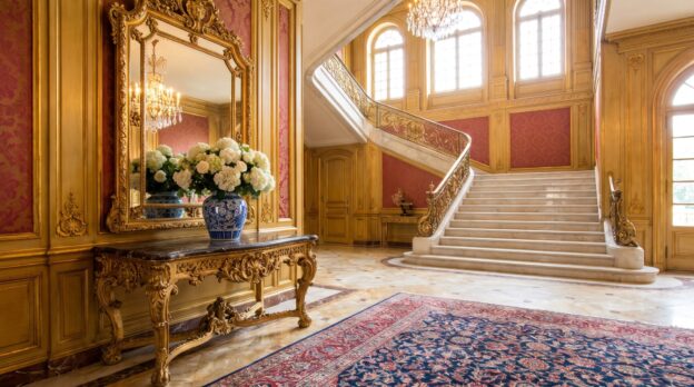
The stairwell is more than a transitional space. It connects the floors, welcomes guests as they enter the house, and accompanies the residents several times a day. Yet it often remains unnoticed, a narrow zone between door and stairs that one passes through without pausing. However, this very space offers the opportunity to make a clear statement with minimal means: a console in the right place transforms the passage area into a consciously designed moment.

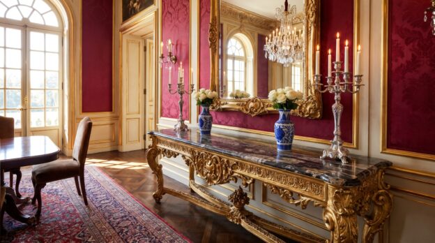
The console stands where space is limited. It projects only thirty to forty centimeters into the room, leaves enough freedom of movement, and yet creates a stage for objects that give the stairwell character. A mirror above doubles the light, a vase with fresh branches brings life to the vertical architecture. What stands here is perceived because the eye inevitably falls upon it when passing by.

The Right Height and Proportion

A console in the stairwell follows different rules than in the living room. The height is oriented not to sitting but to standing and walking. Eighty to eighty-five centimeters is a good guideline, so that the top is at hip height and objects on it appear in the field of vision without having to lower one’s head. The width depends on the stairwell width: in a narrow hallway, eighty centimeters suffice; in a generous staircase, it may be one hundred and ten or more. What matters is that the console emphasizes the wall without narrowing the space.

The depth remains narrow. Forty centimeters is enough to place a lamp, a bowl, and a small object side by side. Those who choose Consoles with curved legs or baroque volutes should ensure that the ornamentation matches the architecture of the house. In a period building with stucco ceilings and tall doors, a richly decorated console continues the historical language. In a modern house with clean lines, a narrow metal console with a marble top appears more harmonious.

From the Casa Padrino collection
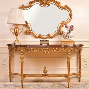
Luxury Baroque Console Dark Brown / Gold 160 cm

The Mirror as Vertical Partner

Ideally, a mirror hangs above the console. It captures daylight from the stairwell window or from the opposite wall and distributes it throughout the space. The stairwell becomes brighter without the need for additional lighting. The mirror should occupy about two-thirds of the console width and be at least sixty centimeters high, so that it works as an independent element and not as an afterthought. The distance between the console top and the lower edge of the mirror is ten to fifteen centimeters, enough space for a tall vase or a table lamp that reflects in the glass.

Casa Padrino offers Mirrors with elaborate frames that give weight to the console and turn the ensemble into a wall composition. A gilded baroque frame reinforces the ornamentation of a carved console, a simple brass frame makes a modern console appear elegant. It is important that the frame does not become too dominant: it frames the glass without outshining the console.

Material and Surface in Dialogue with the Stairs

The material of the console should connect with the stairs and the railing. If the stairs are made of dark wood, the console can take up the same tone or create a contrast, for example through a light marble top on black legs. If the railing is made of wrought iron, a console with a metal frame and glass top fits well. Marble brings coolness and elegance, wood brings warmth and tradition. A console with a drawer offers storage for keys and mail without the surface appearing overloaded.

Casa Padrino combines different materials in many models: a console with a brass frame and black granite top connects lightness with substance, a baroque wooden console with gold leaf finish sets a magnificent accent. The surface must be easy to maintain, as dust accumulates faster in the stairwell than in closed rooms.
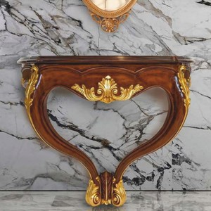
Luxury Baroque Wall Console Brown / Gold 90 cm

Lighting: Accent Rather Than Floodlight

A table lamp on the console creates a targeted point of light. It should not be too tall, so that it does not glare when passing by. Thirty to forty centimeters in height is sufficient. The shade directs the light downward and to the side, illuminates the console top, and casts a soft glow on the wall. Those who wish to forgo a lamp can mount a wall light above the mirror that illuminates the ensemble from above and makes the mirror shine.

Decoration: Less Is Attitude

On the console may stand what gives the room personality without overloading it. A tall vase with branches or grasses uses the vertical of the stairwell, a flat bowl made of brass or marble holds keys and gloves. A single object, a sculpture or a ceramic bowl, makes a clear statement. Those who combine several objects should pay attention to different heights: a tall vase, a medium lamp, a flat bowl form a rhythmic group.

The Decorations changes with the seasons. In autumn, branches with leaves in rust red and ochre stand, in winter bare branches or fir twigs, in spring blooming forsythia. The console becomes a stage for what is currently growing and changing.
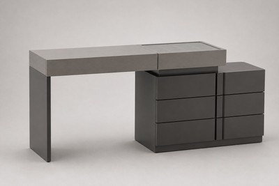
Luxury Dressing Table Gray / Anthracite 180 x 44 x H. 78 cm

Color Scheme: Tone on Tone or Deliberate Contrast

The color of the console can take up the wall color or create a contrast. In a bright stairwell with white walls, a black console with gold details works as a powerful accent. In a dark stairwell with gray or anthracite-colored walls, a console with a light marble top brings brightness. Tone on tone works when the console shows presence through material and form: a white wooden console against a white wall needs a striking silhouette so that it does not disappear.

Stylistic Clarity: Baroque, Art Nouveau, or Modern

The console continues the style of the house. In a Wilhelminian-era building with stucco and double doors, a baroque console with curved legs and carvings fits. In an Art Nouveau house with floral ornaments, a console with organic forms and curved lines harmonizes. In a modern house with clean surfaces, a console with a straight metal frame and stone top appears harmonious. Casa Padrino offers suitable models for every style that integrate seamlessly into the architecture.

  • Baroque console with gold leaf and marble top for historic stairwells
  • Art Nouveau console with floral carvings for period buildings around 1900
  • Modern console with stainless steel frame and glass top for contemporary architecture
  • Chesterfield-inspired console with leather applications for English-influenced interiors

What the Console Achieves in the Stairwell

The console in the stairwell is not a piece of furniture that one needs, but one that one chooses. It gives a room that is often overlooked a function and an aesthetic. It welcomes, pauses, marks the transition between outside and inside, between below and above. With the right height, the appropriate material, and thoughtful decoration, the small surface on the wall becomes a place where the eye rests and the space gains depth.

Related categories: Beds, Flower Pots, Fountains and Water Columns. The full range: Baroque Furniture.
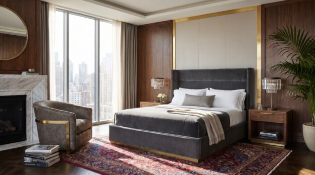
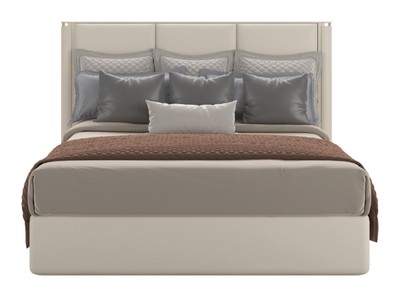
Hotel Flair at Home: What Luxury Hotels Get Right in Interior Design

Hotel Flair at Home: What Luxury Hotels Get Right in Interior Design

When you enter a hotel room and immediately sense that someone has understood what tranquility means, it is rarely due to a single piece of furniture. It is the way light falls on a tabletop, how an armchair relates to the bed, how much space remains between objects. Luxury hotels work with a choreography of proportions, materials and restraint. They create spaces where you arrive without knowing why.

These principles can be translated into your own home. Not as a copy, but as an attitude: less decoration, more structure. Less coincidence, more decision. What works in a hotel room of twenty square metres unfolds a similar effect in a bedroom or suite at home. It is about clarity, not coldness.

The bed as a calm centrepiece

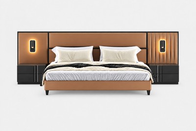
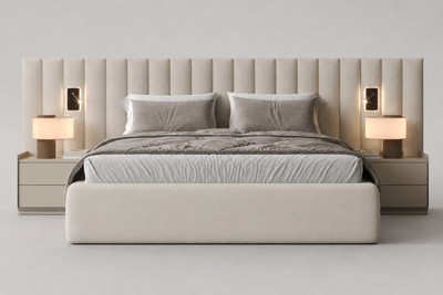
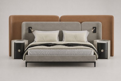
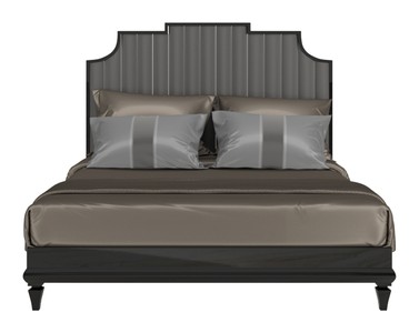
In every good hotel room, the bed is the undisputed centre. It stands free, often centred to the wall, surrounded by air. The bed linen is white or in muted natural tones, the pillows are numerous but ordered. No patterns competing for attention. Instead, fabrics that differ through texture: linen, cotton sateen, perhaps a throw in cashmere or wool. Casa Padrino shows how high-quality Beds with clean lines and fine covers carry a room without dominating it.

Height is crucial. Luxury hotels favour beds that appear slightly elevated, often through an upholstered headboard reaching halfway up the wall. This gives the room structure and the bed weight without becoming bulky. Avoid low futon beds if you are aiming for hotel flair. The proportions only work when the bed has a certain presence.

From the Casa Padrino collection

Luxury Art Deco Double Bed Cream / Gold 195 x 220 x H. 140 cm

Symmetry creates security

Enter a hotel room and you will usually find identical bedside tables, identical lamps to the left and right of the bed. This symmetry is no coincidence. It calms the eye, creates order without having to think about it. In your own bedroom, the principle can be adopted: two identical lights, two identical surfaces. No different heights, no improvised solutions.

The bedside tables themselves should be simple. Dark wood, marble, metal in matt finish. No open shelves, no visible cables. Casa Padrino offers Side Tables in solid oak or with brass details that fulfil precisely this function: they are there, but they do not impose themselves. A small drawer is enough to store the essentials. Everything else belongs elsewhere.

Thinking of light in layers

Hotels never work with a single light source. Instead, there are several levels: ceiling lights for basic brightness, reading lights by the bed, a floor lamp in the corner, perhaps indirect lighting behind the headboard. Each light source has a function, and all together can be dimmed.

For home, this means: forgo the one large ceiling lamp. Instead, rely on table lamps with warm white light, on wall lights with swivel arms, on dimmers at every point. The colour temperature should be uniform, around 2700 Kelvin. Cool white light destroys any hotel atmosphere immediately. Here too: less is more. Three well-placed light sources are better than five mediocre ones.

Luxury Art Deco Double Bed Gray / Black 190 x 220 x H. 160 cm

Materials you can feel

Luxury hotels rely on materials that convince haptically. Solid wood, genuine leather, stone, linen. No plastic surfaces, no foils imitating wood. The surfaces may be matt, even slightly rough. High gloss quickly appears cheap, unless it is polished marble or lacquered metal in small doses.

Combine a maximum of three materials per room. For example: dark oak, light marble, matt brass. Or: oiled walnut, cognac leather, black metal. The repetition of these materials in different places creates coherence. A brass handle on the wardrobe, a brass base on the lamp, a brass frame on the mirror. The eye recognises the pattern and perceives it as harmonious.

The armchair that must not be missing

In almost every upscale hotel room there is an armchair. Not as a place to store clothes, but as a place. A place to drink coffee in the morning, read a book in the evening, simply sit in between. This armchair is never too small and never too bulky. It has armrests, a slight incline, often a footstool nearby.

Casa Padrino offers Armchairs in classic forms that maintain precisely this balance: comfortable but not too deep, elegant but not fragile. The cover should be robust, velvet or firm linen, in a colour that fits into the overall palette. Do not place the armchair directly by the window, but slightly offset, with a small side table next to it. This creates a separate zone in the room without fragmenting it.

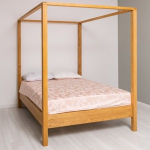
Country Style Canopy Bed Natural 180 x 200 cm

Few things, but the right ones

Hotels do not display personal items. No photographs, no souvenirs, no collections. Instead: a tray on the desk, a carafe with glasses, perhaps a single sculpture. This reduction is not renunciation, but concentration. Each object has weight because it does not have to compete with others.

  • Choose a colour palette of three tones and stick to it: for example white, grey, dark wood.
  • Avoid patterns on large surfaces. If patterns, then on cushions or a rug, never on curtains and bed linen simultaneously.
  • Leave surfaces empty. A bedside table with lamp and book is enough. No alarm clock, no charging cable, no cream.
  • Invest in curtains that reach the floor and fall heavily. Linen or cotton velvet, in a colour that differs only slightly from the wall.

Order as a system, not as an effort

In a hotel room, everything has its place because the place was considered from the beginning. No open shelves, no visible cables, no provisional solutions. Transferred to your own home, this means: create closed storage spaces. Built-in wardrobes reaching to the ceiling, chests of drawers with smooth fronts, boxes in uniform colours.

This approach demands discipline, but it pays off. When every object has a fixed place, the room remains calm even when used daily. Hotels prove that order does not mean sterility. It is the prerequisite for materials and proportions to take effect.

What carries the room

Hotel flair does not arise through decoration, but through omission. Through the decision to show only what truly counts: a bed that invites, an armchair that stays, light that can be adjusted, materials you like to touch. Casa Padrino understands these principles and translates them into furniture that does not look like a hotel, but conveys the feeling. It is about spaces where you arrive without having to explain why.

Related categories: Garden Fountains, Chairs, Display Cabinets. The full range: Baroque Furniture.
Sideboards with Character: Storage That Appears Like Furniture from a Palace

Sideboards with Character: Storage That Appears Like Furniture from a Palace

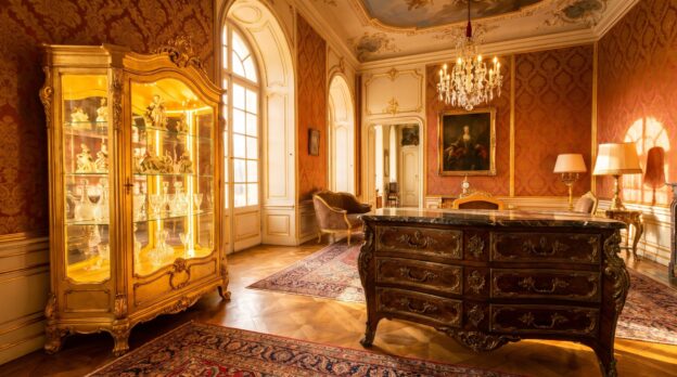
A sideboard rarely stands alone in a room. It leans against the wall, bears a lamp, a tray, perhaps a framed picture. Yet some pieces of furniture of this kind seem to have brought their own history with them: heavy doors with inlays, brass fittings that catch the light, proportions that do not come from mass production. They recall salons where porcelain stood behind glass and silver lay in shallow drawers. Such furniture brings weight into the room, not only through its material, but through its presence.

Those who choose a sideboard with this character decide on more than storage space. It is about a gesture: the piece of furniture may be seen, may have an effect, may structure the room. It needs space, not only in width, but also in perception. Such a piece demands calm around it, walls that do not contradict it, floors that bear its weight. And it demands care in choosing what lies upon it or disappears within it.

Material and Surface: Wood That Shows Age

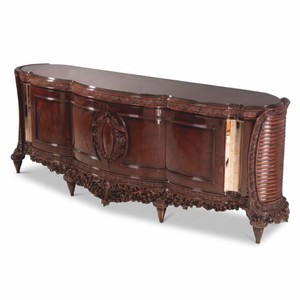
A sideboard with palace character lives from its material. Walnut, mahogany, oak: woods that show grain, that darken, that accept polish. The surface may shine, but not reflect. High-gloss lacquer belongs in other rooms. Here what counts is the haptic quality, the slight unevenness of a hand-polished surface, the transition from dark wood to light inlay work. Inlays of rosewood or maple set accents without becoming obtrusive. They follow the form, emphasize doors or drawer fronts, trace frames. With Sideboards of this kind, the surface is not an accessory, but part of the construction. It shows how the piece of furniture was built, which connections it bears, which details it conceals.

From the Casa Padrino collection

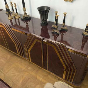
Luxury Baroque Sideboard Dark Brown / Gold 280 cm

Proportions: Width That Orders the Room

A sideboard with character is rarely short. It measures two metres, sometimes two and a half. This width gives it calm. It does not stand lost against the wall, but structures it. The height remains moderate: between 80 and 100 centimetres, enough to hang a picture or a Mirrors above it without the wall appearing overloaded. The depth varies, but 50 centimetres is a good measure. Deeper, and the piece of furniture projects too far into the room. Shallower, and it loses presence. The proportions follow a logic that comes from the 18th and 19th centuries: the piece of furniture should serve, but also represent. It should accommodate things, but itself be a thing of significance.

Fittings and Details: Brass, Bronze, Forged Iron

The handles of such a sideboard are not standard goods. Brass, patinated or polished, bronze with greenish tint, forged iron with matte surface. They do not merely sit on the door, they are set into the construction, screwed, riveted, part of the whole. Keyholes of pierced metal, hinges that remain visible, feet that are turned or carved: these details make the difference. They show that the piece of furniture was not manufactured in series, but according to rules that do not separate craft and design. Casa Padrino works with such details because they give the piece of furniture depth without overloading it.

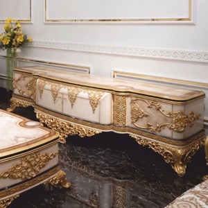
Luxury Baroque TV Cabinet with 4 Doors White / Brown / Gold 280 cm

Interior: Compartments, Drawers, Hidden Order

What a sideboard accommodates usually remains invisible. Yet the way it does so shapes its use. Drawers with felt linings for cutlery, tall compartments for dishes, flat drawers for tablecloths or papers. Some models have adjustable shelves, others fixed divisions. The doors close quietly, the drawers glide on wooden runners or metal rails. Inside it smells of cedarwood or untreated oak, a scent that recalls chests and old cupboards. This order in concealment is part of the character: the piece of furniture does not show everything, but it keeps everything ready.

Combinations: What the Sideboard Bears and Surrounds

A sideboard with palace character needs accompaniment, but no competition. Above it a large Mirrors with gilded frame or an oil painting in dark tones. Beside it a floor lamp with fabric shade, floor-length, not too modern. On the surface: little, but chosen. A tray of silver or lacquered wood, upon it decanters and glasses. A vase with fresh branches, no flowers that are too colourful. A stack of books, lying flat, with linen binding. The wall behind remains calm: light colour, stucco, perhaps wallpaper with discreet pattern. The floor: parquet, planks, a carpet that frames the piece of furniture without covering it.

  • Dark wood combines with light walls, cream, grey, pale green.
  • Brass and bronze tolerate gold, not chrome or stainless steel.
  • A mirror above the sideboard doubles the light, but not the disorder.
  • Symmetry works: two candlesticks, two vases, two chairs beside it.
  • Fewer objects, but those with weight: marble, crystal, ceramics with glaze.
Luxury Art Deco Sideboard Purple Brown / Gold 205 x 58 x H. 87 cm

Rooms That Bear Such a Piece of Furniture

Not every room tolerates a sideboard with this claim. It needs height: ceilings from 2.80 metres, better more. It needs length: a wall that is not interrupted by doors or windows. It needs light, but not harsh light. Daylight from the side, evening light from lamps that do not glare. The room may not be too full. A dining table, chairs, perhaps a display cabinet, no more. The sideboard stands in the dining room, in the salon, in the hallway of a period building. It stands where guests are received, where things lie ready that one needs, but does not constantly see. Casa Padrino shows such furniture in rooms that take their architecture seriously: stucco, parquet floors, tall windows.

Care: Polish, Wax, Gentle Hand

A sideboard of solid wood with polished surface wants to be cared for. Dust is wiped with a soft cloth, slightly dampened, never wet. Once a year a treatment with furniture wax or care oil, thinly applied, rubbed in, polished afterwards. Stains are removed immediately, before they penetrate the wood. Brass and bronze darken, that belongs to it. Those who prefer it lighter polish with a special agent, but not too often. The patina is part of the character. Drawers that stick are rubbed with candle wax on the runners. Doors that creak receive a drop of oil on the hinges. This care is not effort, but routine. It keeps the piece of furniture in form without changing it.

Staging: Light That Emphasizes the Form

A sideboard with palace character needs light that shows its contours. A lamp on the surface that shines upwards and illuminates the wall. Spotlights from the ceiling that make the wood shine without glaring. Candles in heavy candlesticks that flicker and cast shadows. The light may not be uniform. It may create contrasts, may highlight inlays, may make fittings sparkle. In the evening, when only a few lamps burn, the sideboard becomes the focal point. It no longer merely stands there, it has an effect. The Decorations upon it recedes, the piece of furniture itself becomes the picture.

What Makes a Sideboard with Character

A sideboard that appears like a piece of furniture from a palace is no accident. It is the result of decisions: for material that shows age, for proportions that structure the room, for details that make craftsmanship visible. It is a piece of furniture that does not disappear, but remains. That does not follow the trend, but a tradition. That is not loud, but self-evident. Those who choose such a piece choose a piece of furniture that bears the room, that gives it weight, that lends it character. Casa Padrino understands this language: the language of furniture that is more than function, that does not separate form and content, that shows what a room can be when one gives it time and attention.

Related categories: Garden Fountains, Chairs, Display Cabinets. The full range: Baroque Furniture.
Red, Green, Blue: The Classic Baroque Colours and How to Combine Them

Red, Green, Blue: The Classic Baroque Colours and How to Combine Them

The colours of the Baroque are not a matter of taste, but a matter of attitude. Red stands for power and passion, green for wealth and nature, blue for heaven and nobility. Those who unite these three colours in a room create not arbitrariness, but hierarchy. Each colour claims its place, each carries a story. The room becomes a stage on which fabrics, wood and gilding enter into dialogue with one another.

The art lies not in showing all three colours simultaneously, but in distributing them so that the room can breathe. A deep ruby red on the wall, an emerald green velvet cover, a cobalt blue accent in the upholstery: these are not coincidences, but deliberate choices. Those who combine Baroque colours need courage for clarity and a sense of proportion. For what works in a palace can feel oppressive in a living space if one does not know the rules.

Red as the Leading Colour: Warmth with Weight

Red dominates the room, whether one wants it to or not. It draws the eye, it heats up the atmosphere, it demands resistance. In the Baroque period, red was chosen for throne rooms and audience chambers because it radiated authority. Today it works in rooms that should unite intimacy and presence: dining rooms, libraries, salons. The choice of red tone determines the effect. An oxblood red appears heavy and serious, a carmine red luminous and lively, a bordeaux muted and elegant.

Red needs dark wood as a partner. Walnut, mahogany or stained oak give red stability and prevent it from tipping into shrillness. Gilding sets accents without breaking the warmth. Those who choose Sofas in red should keep the wall in broken white or a light grey tone, so that the furniture does not merge with the room. Casa Padrino shows how a ruby red velvet sofa with golden feet becomes the gravitational centre of a salon without overwhelming the room.

From the Casa Padrino collection

Luxury Velvet Sofa Dark Blue 203 cm

Green as Counterpoint: Calm and Wealth

Green is the colour that grounds red. It brings coolness into the heat, nature into the splendour. In the Baroque period, green stood for prosperity, because green pigments were expensive and difficult to produce. A rich emerald green or a dark moss green gives the room depth without weighing it down. Green works as a wall colour in rooms with high ceilings and large windows, but also as upholstery fabric for seating furniture that should not stand in the foreground.

The combination of green and red requires a buffer. Gold is this buffer. Gilded frames, candelabras or table legs create distance between the two strong colours and allow them to coexist without cancelling each other out. A green velvet fabric on an Armchairs does not appear as a contradiction next to a red sofa, but as a deliberate choice, when both pieces of furniture are connected by golden details. Casa Padrino relies on this balance and shows how green as a calm counterpoint to red structures the room.

Blue as Accent: Coolness and Distance

Blue is the most restrained of the three Baroque colours, but not the weakest. It brings coolness and expanse into the room, it opens the perspective. Cobalt blue, Prussian blue or a dark midnight blue work as accent colours, not as surface colours. Blue is used where one wants to direct the gaze: in the upholstery of a chair, in a wall panel, in a carpet. It is the colour that holds red and green together, because it competes with neither one nor the other.

Blue goes better with silver than with gold. Where red and green demand warm metal tones, blue needs the coolness of chrome-plated or silver-plated surfaces. A blue velvet cover on a chair with silver feet appears elegant and distanced, without being cold. Those who choose Chairs in blue should use them sparingly: two chairs at an otherwise red-green dominated table are sufficient to complete the composition.

Luxury Velvet Sofa Dark Brown 233 cm

Proportions and Distribution: Who Dominates the Room

The three Baroque colours only work when their proportions are clearly distributed. One colour leads, a second supports, the third accentuates. A room in which red, green and blue occur in equal parts appears indecisive. The classic rule states: 60 per cent main colour, 30 per cent accompanying colour, 10 per cent accent. Red can be the main colour when the room needs warmth and presence. Green takes the lead in rooms that should promote calm and concentration. Blue almost always remains an accent.

The distribution occurs through walls, furniture and textiles. A red wall demands green or blue furniture, a green wall tone requires red or blue accents. Those who are uncertain choose neutral walls and set the colours through upholstered furniture, curtains and carpets. Casa Padrino offers furniture that already considers this colour distribution: a red sofa with golden details, a green armchair with carved legs, a blue chair with silver fittings. The furniture carries the colour, the room gives them the frame.

Materials and Surfaces: Velvet, Silk, Wood

Baroque colours need materials that refract light and create depth. Velvet is the classic fabric for red and green, because it makes the colour appear lighter or darker depending on the incidence of light. Silk works for blue, because it enhances shine and coolness. Wood should be dark: walnut, mahogany, ebony. Light woods such as birch or maple do not suit the colour world of the Baroque, they take the weight from the colours.

Gilding is not decoration, but structure. It connects the colours, it creates transitions, it sets points of light. A gilded frame around a mirror, gilded feet on a table, gilded fittings on a chest of drawers: these are the details that distinguish a Baroque room from a mere colour combination. Casa Padrino understands these details and applies them consistently, without falling into overload.

Luxury Velvet Sofa Orange 273 cm

Light and Shadow: How Colours Live

Baroque colours change with the light. A ruby red that glows in daylight becomes dark and mysterious by candlelight. An emerald green that shines in the sun appears muted and restrained under artificial light. Those who work with these colours must consider the light. Direct lighting makes red appear aggressive, indirect lighting makes it warm and inviting. Green needs soft light to avoid tipping into yellowish tones. Blue tolerates cool light without losing its elegance.

  • Combine red with warm white light to avoid harshness
  • Illuminate green with diffuse light to create depth
  • Accentuate blue with cool white light to preserve clarity
  • Spotlight gilding with targeted spots to set highlights
  • Use candles and chandeliers to create the historical lighting atmosphere

What Carries the Room: Clarity Instead of Abundance

The classic Baroque colours work not through quantity, but through precision. Red, green and blue need space to take effect, they need dark wood to find stability, and they need gold or silver to speak with one another. Those who combine these colours create not decoration, but architecture. The room becomes a total work of art, in which each colour knows and fulfils its task. Casa Padrino delivers the furniture that can carry this task: with presence, with craftsmanship, with the naturalness that constitutes genuine Baroque culture.

Related categories: Fountains and Water Columns, Coffee Tables, Decorations. The full range: Baroque Furniture.
XXL Sculptures as Eye-Catchers: How Large Figures Shape Entrance and Park

XXL Sculptures as Eye-Catchers: How Large Figures Shape Entrance and Park

A three-metre-high figure in the entrance area creates an accent before the eye takes in the architecture. Such XXL sculptures redefine the space: they mark transitions, create orientation and transform a simple driveway into a deliberately staged arrival. Whether a bronze-coloured lion, an abstract stele or a larger-than-life human figure, the effect arises from the relationship between mass, material and surroundings.

In parks or gardens, large figures assume a similar role to specimen trees: they structure the area, draw the eye and give the space depth. While small decoration subordinates itself to the ensemble, monumental sculptures assert themselves as independent protagonists. They need air, a clear location and a considered interplay with ground surfaces, planting and light.

Material and Durability: What Monumental Formats Must Deliver

XXL sculptures stand permanently outdoors and must withstand frost, UV radiation and mechanical stress. Bronze and cast iron develop a natural patina over the years that intensifies their character. Resin and Fiberglass Sculptures, on the other hand, offer lower weight with high detail fidelity and can be manufactured in almost any surface texture: from matt stone appearance to glossy metallic finish. For locations with frequent wind or on roof terraces, the reduced weight is a decisive advantage.

Stone, whether marble, granite or sandstone, brings mass and permanence. A two-tonne figure requires a solid foundation and precise planning during transport. In return, a presence emerges that does not feel artificial. Casa Padrino carries both classic stone sculptures and modern composite materials that are barely distinguishable in feel and appearance but are more flexible in handling.

From the Casa Padrino collection

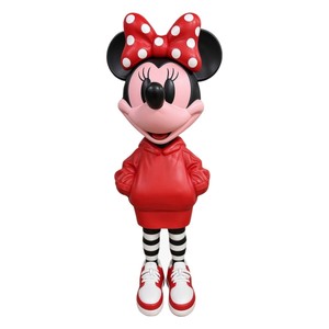
Decorative Sculpture Purple / Pink / Neon Yellow H. 115 cm

Site Selection: Where Large Figures Unfold Their Effect

The entrance area functions as a natural stage. A sculpture to the left or right of the front door, on a low plinth or directly on the paving, receives visitors and gives weight to the access. Symmetry reinforces the representative effect, while an offset placement directs the gaze and creates tension. The distance from the facade is important: at least one and a half metres of clearance prevents the figure from being visually pressed into the wall.

In parks, sight lines, path crossings or lawns are suitable. A sculpture at the end of an avenue draws the eye into depth. On a clearing or in the middle of a gravel area, it becomes a point of calm. The transition between different garden areas, such as from terrace to lawn, can also be marked by a large figure. Casa Padrino recommends first simulating the surroundings with wooden stakes or boxes in original size before making the final decision.

Proportion and Scale: How Size Functions in Space

A 2.50-metre-high figure appears appropriate in an extensive park, overwhelming in front of a terraced house. The scale must suit the architecture: villas and manor houses tolerate monumental formats, modern single-storey buildings require slimmer proportions or abstract forms. The surroundings also play a role. High hedges, mature trees or a wide driveway relativise the size of a sculpture, while open areas emphasise it.

A proven ratio: the sculpture should reach approximately two-thirds of the surrounding vertical elements. If it stands next to a three-metre-high wall, it may measure two metres itself. If it remains significantly smaller, it loses presence. If it exceeds the surroundings, a deliberate dominance emerges that can work aesthetically but requires courage.

Decorative Sculpture Red / Black / White H. 115 cm

Stylistic Directions: From Classical to Contemporary

Classical figures, lions, angels, mythological characters, suit historic estates and formal gardens. They follow a long tradition and lend dignity to the space. Bronze or cast stone underlines this character. Modern sculptures, geometric bodies, organic forms or stylised animals, function in minimalist environments and alongside contemporary architecture. High-gloss polished stainless steel reflects the surroundings, matt Corten steel develops a rust-brown patina that harmonises with gravel and grasses.

Figurative works, larger-than-life humans or animals in realistic representation, generate an immediate emotional effect. They can suggest movement or rest within themselves. Abstract works, by contrast, invite interpretation and often integrate more easily into various contexts. Casa Padrino offers both directions and advises on selection according to location, light and personal taste.

Colour and Surface: How Material Plays with Light

Dark surfaces, anthracite, bronze, black, recede under overcast skies and gain contour in sunlight. Light sculptures in white marble or pale artificial stone glow even in shade and create clear accents. Metallic finishes reflect the time of day: cool in the morning, warm in the evening. Patinated bronze shifts between green, brown and grey, depending on light incidence and weather.

The surface also influences haptic perception. Polished surfaces appear refined and distant, rough textures invite touch and integrate more organically into nature. For Sculptures in immediate proximity to the terrace or pool, a surface that does not become slippery when wet and has no sharp edges is recommended.

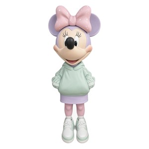
Decorative Sculpture Pastel Pink / Mint / Lilac H. 115 cm

Lighting: Sculptures After Nightfall

Without targeted lighting, even a monumental figure disappears after sunset. Ground spotlights, placed approximately 1.50 metres in front of the sculpture, cast dramatic shadows and emphasise plasticity. Warm white light, 2700 to 3000 Kelvin, creates an inviting atmosphere, while neutral white light from 4000 Kelvin draws forms more sharply and suits modern works.

Multiple light sources from different angles prevent harsh contrasts and model the figure three-dimensionally. Dimmable LED systems allow adjustment to the season and use of the outdoor area. In winter, when the garden rests, lighting can be more restrained. In summer, during celebrations or evening gatherings, it may be more present. Casa Padrino works with lighting designers who consider sculptures and surroundings as a unity.

Care and Maintenance: What Monumental Figures Require

  • Bronze and copper: rinse once annually with clear water, use no chemicals if patina is desired, apply special care wax for uniform surface
  • Stone: remove moss and algae with soft brush, no pressure washers on porous material, renew impregnation every two to three years
  • Resin and fibreglass: clean with mild detergent and sponge, use repair kits for scratches, refresh UV protection lacquer every five years
  • Stainless steel: remove fingerprints with microfibre cloth and stainless steel cleaner, treat polished surfaces regularly

Integration into Planting: Sculpture and Greenery in Dialogue

Low grasses, lavender or box frame a sculpture without obscuring it. Tall perennials or bamboo create a background that highlights the figure. It is important that the planting respects the proportions: a three-metre-high sculpture tolerates large-volume companions, while a delicate figure is overwhelmed by too much greenery.

Colouring also plays a role. Dark sculptures benefit from light flowers or silvery foliage, light figures from dark backgrounds. Evergreen plants guarantee year-round effect, while seasonal bloomers provide changing accents. For Garden Decoration of this scale, collaboration with a landscape architect who plans sculpture and vegetation as an overall composition is worthwhile.

What Anchors a Monumental Sculpture in Space

XXL figures are more than decoration. They structure outdoor space, create identity and remain in memory. Their effect arises from the choice of material, the precise location and the interplay with light, architecture and planting. Anyone who installs a large sculpture makes a long-term decision that shapes the character of an entrance or park for decades. Casa Padrino understands this responsibility and offers not only the objects themselves but also the consultation that such projects require.

Related categories: Consoles, Columns and Pedestals, Armchairs. The full range: Baroque Furniture.
The Library as a Retreat: Armchair, Reading Light and Dark Wood

The Library as a Retreat: Armchair, Reading Light and Dark Wood

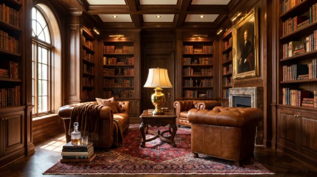
A library is more than a room for books. It is a refuge where time moves differently, where silence does not feel empty but is filled with the presence of countless stories and thoughts. Dark wood on the walls, tall shelves reaching up to the ceiling, and in the centre an armchair that not only offers space but invites one to linger. The reading light casts a warm cone onto the open pages, while the rest of the room remains bathed in soft semi-darkness.

Those who furnish a library create a place of concentration and retreat. What matters here is not the representative, but the atmospheric: the feel of leather, the grain of wood, the weight of a bound book in one’s hand. Casa Padrino understands these spaces as places where furniture is not merely functional but expresses an attitude. A library requires furniture that endures, that does not impose itself and that gives the room depth.

The Centre: The Armchair as a Place of Immersion

The right Armchairs determines whether a library is used or merely admired. It should have a high backrest that supports the neck, armrests at a height that allows one to hold a book for hours, and a seat depth that is neither too shallow nor too deep. Leather in dark brown or muted green blends into the wooden architecture without disappearing. Velvet in midnight blue or anthracite brings a textile warmth that softens the room. The armchair does not stand centrally but slightly offset, so that the view falls on the shelves whilst daylight can enter from the side. Casa Padrino offers models that remain classic in their proportions yet provide contemporary comfort, such as Chesterfield armchairs with deep button tufting or wing chairs with clear lines.

From the Casa Padrino collection

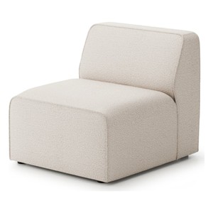
Luxury Armchair Beige 75 cm

Reading Light: Directed, Warm, Indispensable

Without the right light, the library remains a shadowy space. A floor lamp with a swivelling arm stands beside the armchair, its height chosen so that the light falls over the shoulder onto the book pages. The bulb should be warm white to protect the eyes and not distort the wood tones. Brass or burnished metal as the lamp material fits into the dark colour palette. Additionally, wall lights can be installed along the shelves, illuminating the wood from below and thus creating depth. It is important that the light never illuminates the entire room uniformly but creates islands: here the reading place, there an illuminated shelf, in between the calming darkness.

Dark Wood: Walnut, Mahogany, Stained Oak

Wood shapes the character of the library more strongly than any other material. Walnut with its fine, lively grain lends the room elegance without coldness. Mahogany, deep reddish-brown and uniform in structure, brings a classic weight that signals permanence. Oak, darkly stained or smoked, appears more earthy, more robust, less formal. The shelves should be floor-to-ceiling, with adjustable shelves that adapt to different book formats. Closed cabinets in the lower section accommodate what should not be visible: folders, technical devices, personal papers. Casa Padrino manufactures such library furniture to measure, so that it fits seamlessly into the architecture of the room, without gaps or forced proportions.

Luxury Leather Armchair Brown / Silver 85 cm

Complementary Furniture: Side Table, Ladder, Sideboard

A small table beside the armchair is essential. It holds the cup, the bookmark, the notebook. The top should be wood or marble, the legs slender, so that the table does not appear intrusive. Side Tables in round form fit more harmoniously into the room than angular models, they break the severity of the shelves and create a more intimate zone around the armchair. If the shelves reach to the ceiling, a ladder belongs with them, ideally made of wood with brass fittings, running on a rail. It is functional and at the same time a design element that emphasises the verticality of the room. A Sideboards on the opposite wall provides space for objects that make the room personal: a collection of old globes, framed prints, a decanter with glasses. The sideboard should match the shelves in wood type and colour tone, but may differ slightly in formal language, for instance through curved fronts or inlaid marquetry.

Colour Palette and Textiles: Restraint with Accents

The colour scheme of a library lives from nuances. Dark wood forms the basis, complemented by muted tones: bottle green, burgundy, navy blue, anthracite. Walls can be kept in dark grey-green or deep beige to envelop the room without overwhelming it. A rug in muted red or blue dampens sound and defines the reading zone. Curtains of heavy velvet or linen in natural tone regulate daylight and reinforce the seclusion. Cushions on the armchair may add colour but should remain refined in material and tone: velvet, silk, wool, no garish patterns. In its showrooms, Casa Padrino often combines dark furniture with textile accents in jewel tones that give the room depth without making it restless.

Luxury Art Deco Armchair Black / Brown / Gold 80 x 72 x H. 105 cm

Principles for Furnishing a Library

Certain principles help to create a coherent space:

  • Wood and leather dominate, metal appears only as an accent: fittings, lamps, bookends.
  • The armchair never stands with its back to the door, but positioned so that the view goes into the room or towards the window.
  • Books are not sorted by colour but by subject or format, to avoid visual unrest.
  • Closed surfaces and open shelves alternate to give the eye points of rest.
  • Personal objects are used sparingly, each should have a story or fulfil an aesthetic function.

The Library as a Counterpoint to Haste

A well-designed library is a space that refuses acceleration. It does not invite quick browsing but prolonged dwelling. The dark wood absorbs light and sound, the armchair supports the body, the reading light focuses the gaze. Casa Padrino understands such spaces as places where furniture does not merely fulfil a function but creates an atmosphere that sustains. Those who sit here do not merely read but step out of time for a while.

Related categories: Commodes, Consoles, Columns and Pedestals. The full range: Baroque Furniture.
Recognizing reputable luxury furniture suppliers: what matters before purchase

Recognizing reputable luxury furniture suppliers: what matters before purchase

An armchair with a carved frame, gold leaf on the edges, and upholstery in heavy velvet is an investment for decades. All the more curious that many such purchases today begin on a product page where you can neither feel the fabric nor see the craftsman’s hand. On screen, there is often no visible difference between a house that has been manufacturing and delivering furniture for years and a shop that merely passes on images.

Yet the difference exists, and it can be verified. If you take a calm look at a few things before ordering, you can usually recognize a reputable luxury furniture supplier within fifteen minutes. The following points will help, whether it concerns a single chest of drawers or the furnishing of an entire floor.

The company behind the shop

The first look belongs to the imprint. A reputable dealer lists a complete address, a legal form, the register entry, and a VAT identification number. A telephone number where someone actually answers says more than any contact form. If there is a showroom, a visit is worthwhile, or at least a call with a specific question about dimensions or material. The nature of the answer reveals much: those who know their range answer precisely and without evasion.

Materials are named, not described vaguely

High-quality furniture carries its materials openly in the description. Solid wood with wood species, gold leaf or gold-colored lacquer, genuine marble or artificial stone, brass or coated metal: a good supplier writes it as it is. Vague phrases such as “noble appearance” or “high-quality look” do not replace information. Equally important are complete dimensions, for seating furniture also seat height and seat depth, for cabinets the internal measurements.

Images that show the furniture

A single cut-out photo is not sufficient for furniture in this price range. Look for several views, close-ups of carving, fittings and seams, and whether the colors are consistent across all images. If the same photo appears in identical form in many shops, it usually comes from the manufacturer. This is not dubious, but then the dealer should additionally be able to explain which version exactly will be delivered.

Reading reviews correctly

Reviews are helpful if you read them like witness statements and not like a grade. A few rules have proven useful:

  • Compare several sources: Google, shop quality seals and review platforms together paint a more honest picture than a single number.
  • Pay attention to the content: concrete descriptions of delivery, packaging and workmanship weigh more than a brief “all great”.
  • Check the date: current voices say more about today’s service than praise from five years ago.
  • Read the dealer’s responses: how they handle criticism shows how they will deal with you in a critical situation.

Specifically for the luxury sector, it is worth taking a look at reviews of luxury furniture suppliers on TrustDeluxe, where buyers describe their experiences with furniture houses and manufactories. There too: better to read ten detailed reports than just look at the average.

Delivery, assembly and the critical case

With large and heavy furniture, logistics determine the joy of the purchase. Ask in advance who delivers, whether a forwarding agent comes, how far delivery extends and whether assembly or disposal of packaging is included. A reputable supplier also explains what happens in the event of transport damage: how it is reported, who inspects it and how quickly replacement or repair follows. Clear answers before purchase are the best sign that things will continue just as clearly after purchase.

Consultation and custom manufacturing

Particularly with classic styles such as Baroque or Art Nouveau, many buyers wish for a different color, a different upholstery or a deviating dimension. Houses that manufacture themselves or work closely with their workshops can usually implement this and send fabric samples or drawings before production begins. At Casa Padrino, for example, many pieces are created in this way according to customers’ wishes. A supplier who takes such questions seriously thereby also shows that they are familiar with their furniture.

Trust arises from what can be verified

In the end, it is not a single seal that carries the decision, but the overall picture: a real company with reachable people, honestly named materials, meaningful images, reviews from several sources and clear information about delivery and damage cases. Those who check these points buy with greater peace of mind and enjoy good furniture for a long time. Casa Padrino gladly submits to this scrutiny, because with furniture for generations, transparency is the most important quality of the dealer.

Bedroom Like a Suite: Bed, Dresser and Mirror in Harmony

Bedroom Like a Suite: Bed, Dresser and Mirror in Harmony

A bedroom that feels like a suite is not created by individual pieces of furniture, but by their interplay. When the bed corresponds with the dresser and the mirror brings both into dialogue, an order emerges that makes the room larger than it is. The proportions are right, the materials respond to one another, and even in the morning half-light, you know where each piece stands.

Anyone who wants to achieve this impression must understand three things: how furniture relates to one another, which materials reinforce each other, and where symmetry helps or hinders. This is not about decoration, but about architecture on a small scale. Casa Padrino shows how classic furniture with clear lines and considered surfaces can carry a room without overloading it.

The Bed as Anchor Point

The bed determines the axis of the room. It should stand freely, with distance from the wall, so that the headboard and frame can unfold their effect. A tall headboard in upholstered velvet or carved wood creates presence without taking up space. The bed height should ideally be 55 to 60 centimetres including mattress, so that you can sit upright. Upholstered beds in anthracite or taupe fit into bright rooms, while dark wood with visible grain brings depth. The width is decisive: 180 centimetres create generosity without dominating the room. Beds with clear proportions and restrained details appear natural, not staged.

From the Casa Padrino collection

Luxury Double Bed Cognac / Black 320 x 215 x H. 105 cm

The Dresser as Counterweight

The dresser stands opposite the bed or to the side against the wall, never directly next to it. Its height is between 80 and 95 centimetres, so that it forms a horizontal line with the headboard without towering over it. Three or four drawers in even division create calm, high-gloss fronts reflect light, matte surfaces absorb it. Marble on the top brings coolness, oiled walnut warmth. The width should be about one third of the bed width, so 60 to 70 centimetres for a 180-centimetre bed. Commodes with brass handles or inlaid marquetry set accents without being obtrusive, when the material matches the bed.

The Mirror as Room Opener

A large mirror above the dresser doubles the light and lets the room breathe. Its width corresponds roughly to the width of the dresser, but can also extend 10 to 15 centimetres beyond. The distance between the top edge of the dresser and the bottom edge of the mirror is 10 to 20 centimetres, no more, otherwise the connection is lost. Frames in gilded wood or matte brass bring structure, while frameless variants recede. A standing mirror next to the bed only works if the room is wide enough and the bed does not stand against the wall. Mirrors with slightly curved glass or bevelled edges break the light more softly than flat surfaces.

Luxury Double Bed Cream 338 x 230 x H. 120 cm

Materials That Complement Each Other

Wood, marble, velvet and brass are the four materials that carry a bedroom. Wood brings warmth and structure, marble coolness and weight, velvet softness, brass shine. They need not all appear, but if they do, then in clear hierarchy. A bed in dark walnut tolerates a dresser with white Carrara marble if the handles are in brushed brass. An upholstered bed in taupe harmonises with a dresser in stained oak if the mirror has a narrow gold frame. What matters is that each material appears twice: wood on the bed and on the frame, brass on the handles and on the lamp, marble on the dresser and on the bedside table.

Rules for Proportions and Distances

For bed, dresser and mirror to work as a unit, fixed distances and ratios apply:

  • The distance between bed and dresser is at least 80 centimetres, better 100, so that the room does not become cramped.
  • The dresser is at most half as wide as the bed, so that it does not compete.
  • The mirror hangs so that its centre is at eye level, about 150 to 160 centimetres above the floor.
  • Bedside tables stand symmetrically left and right of the bed, their height corresponds to the top of the mattress.
  • Lamps on the bedside tables are 50 to 60 centimetres high, so that the light does not dazzle.
Luxury Double Bed Gray / Cognac 330 x 230 x H. 112 cm

Colours That Hold the Room Together

A bedroom like a suite lives from few colours in many nuances. Grey, beige, taupe and anthracite form the basis, plus an accent in dark green, navy blue or rust red. The walls remain light, in broken white or pale greige, so that the furniture works. Textiles pick up the wood tones: bed linen in linen or cotton sateen, a rug in cream or light grey, curtains in heavy velvet or light linen. Casa Padrino combines classic forms with reduced colour palettes, so that the room remains calm without becoming cold.

Light That Creates Depth

Indirect light makes the furniture appear sculptural. Bedside lamps with fabric shades cast soft light on the wall, a floor lamp next to the dresser emphasises its surface. Uplighters or LED strips behind the headboard lift the bed from the background. The mirror reflects the light and distributes it in the room without dazzling. Dimmable bulbs with warm white light, about 2700 Kelvin, create atmosphere without making you tired. Candles on the dresser or on a tray next to the mirror bring movement to the light.

What Carries the Room

A bedroom like a suite emerges when bed, dresser and mirror do not merely stand next to each other, but refer to one another. The proportions are coordinated, the materials respond to each other, the colours remain quiet. Casa Padrino shows that classic furniture with clear lines and considered details can carry a room without staging it. No decoration is needed when the architecture is right.

Related categories: Display Cabinets, Resin and Fiberglass Sculptures, baroque mirrors. The full range: Baroque Furniture.
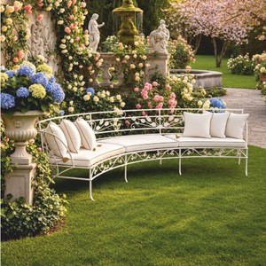
Art Nouveau in the Garden: Cast Iron, Tendrils and Seating with History

Art Nouveau in the Garden: Cast Iron, Tendrils and Seating with History

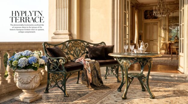
The shadow of an old chestnut tree falls on a bench made of dark green cast iron. The backrest shows tendrils winding around stylized blossoms, each line following the organic curve that Art Nouveau elevated to an art form. Next to the bench stands a tall planter, its relief showing thistles and poppy capsules, patinated by weather, firmly anchored in gravel. Such gardens tell of a time when iron was not merely functional, but became ornament.

Those who design an Art Nouveau garden today seek not the playful, but the formed: furniture and objects that work through their lines, through material that ages without decaying, and through an attitude that does not imitate nature, but interprets it. It is a style that demands calm, clear spaces where each piece receives its own room. Not a hodgepodge, but a deliberate placement.

Cast Iron as the Defining Material

Art Nouveau in the garden lives through cast iron. The material lasts decades, bears weight, shows structure. Benches, chairs, tables: they all receive through casting that depth of detail that wood or aluminum cannot achieve. The surface may be rough, may develop rust, as long as the primer holds. What matters is the form. Baroque and Art Nouveau Garden Furniture made of cast iron brings this quality: they stand heavy, do not shift in the wind, and their ornamentation remains legible, even when moss grows in the recesses.

The coloring follows a clear rule. Dark green, anthracite, matte black: these are the tones that do not compete in the garden’s greenery, but recede. Those who want to set accents choose a light stone gray or a muted ochre, but only for individual pieces. Glossy lacquers have no place here. The patina belongs to the concept.

From the Casa Padrino collection

Luxury Art Nouveau Sofa White 435 cm

Tendril Motifs and Organic Lines

The ornament in Art Nouveau follows the plant, not geometry. Tendrils wind, leaves bend, stems swing. These motifs appear in backrests, table legs, fence panels. They are never symmetrical in the classical sense, but always balanced. The line guides the eye without rushing it. A good Art Nouveau piece shows this movement in stillness: you see the tendril, but it does not impose itself.

Proportion is important. Too much ornament makes the piece appear restless, too little makes it arbitrary. The balance lies in reduction: a central motif in the backrest, a restrained relief on the sides, smooth surfaces in between. This creates furniture that does not tire even after years.

Composing Seating Areas

An Art Nouveau garden requires clear seating areas. Not furniture groups that can be moved arbitrarily, but places that are set. A bench under a tree, a pair of chairs at a small table in front of a hedge, a seating group on a paved surface. The ground plays along: gravel, light natural stone, dark brick. Wooden decks do not fit, concrete only if it is old and weathered.

The orientation follows the light. Morning sun for the breakfast table, shade in the afternoon for the reading bench. Garden Furniture in Art Nouveau style is heavy enough to remain in place, and that is intentional. They mark the location, they create structure. Those who move them change the garden.

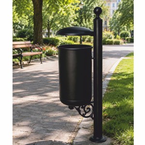
Art Nouveau Park Waste Bin Black H. 100 cm

Planters as Architectural Elements

Tall planters made of cast iron or cast stone set vertical accents. They stand at entrances, flank paths, mark transitions between garden rooms. Their form is often cylindrical or slightly conical, the relief shows foliage, fruits, sometimes stylized faces. The planting remains restrained: boxwood, hydrangeas, tall grasses. No colorful summer bloomers, no overhanging cascades.

The size must be right. A planter that is too small appears lost. One too large dominates. The rule of thumb: the height of the planter should be about one third of the height of the plant when fully grown. Flower Pots with Art Nouveau ornaments often bring this proportion already, their design accounts for the plant as part of the composition.

Combination Rules for the Art Nouveau Garden

Not everything that looks old fits together. Art Nouveau does not tolerate baroque flourishes, rustic wooden benches, or modern lounge furniture. The mixture only works within a clear line. A few rules help with selection:

  • Combine cast iron with natural stone, not with wood or plastic.
  • Green tones and anthracite as base colors, accents only sparingly set.
  • Complement organic ornaments with clear, calm plantings, no wild perennial beds.
  • Choose few but striking pieces, do not fill the garden.
  • Allow patina, but keep construction intact.

Lighting and Details

Light in the Art Nouveau garden comes from lanterns, wall lights, ground spotlights. The fixtures themselves often bear the same tendril motif as the furniture, are made of cast iron or patinated brass. The light is warm, never harsh, often indirect. It highlights the ornaments, casts shadows on paths and walls. LED technology is permitted, as long as it remains invisible.

Small details complete the picture: a cast iron umbrella stand next to the bench, a bird bath with relief decoration, a wrought iron climbing trellis on the wall. These objects need not all come from the same period, but they should follow the same formal language. Casa Padrino offers such pieces that integrate seamlessly because they respect historical proportions without being copies.

Care and Durability

Cast iron in the garden requires little care, but the right kind. Once a year check the surface, treat rust spots with a wire brush, prime, repaint. The material itself lasts forever, only the coating needs renewal. It is important that the furniture stands dry, that water can drain, that no moisture remains under the paint.

The investment in such pieces is long term. They outlast trends, adapt, because they are not fashionable, but formal. An Art Nouveau garden can grow over decades, can be supplemented without the old losing its validity. This distinguishes it from gardens that must be rethought every few years.

What Sustains the Art Nouveau Garden

In the end, it is the clarity that defines this garden style. Few materials, a consistent formal language, an attitude that seeks the enduring. Cast iron, stone, green: nothing more is needed. The furniture stands where it should stand, the plants grow in planters that frame them, the light falls on ornaments that need not be loud. Casa Padrino understands this logic, offers pieces that in such gardens are not decoration, but architecture. Those who have once sat under an old chestnut tree on a cast iron bench understand why this style does not fade.

Related categories: Sofas, Mirrors, Garden Fountains. The full range: Baroque Furniture.
The Art of the Display Cabinet: Staging Porcelain, Crystal, and Collectibles

The Art of the Display Cabinet: Staging Porcelain, Crystal, and Collectibles

A display cabinet is far more than a piece of furniture with glass doors. It is both stage and frame, a place where Meissen porcelain stands beside Bohemian crystal and every vase, every bowl tells its own story. Light falls through the panes, refracts in cut edges, casts soft shadows on velvet-lined back panels. Anyone who owns a collection knows: the right presentation determines whether objects stand mute on the shelf or invite dialogue.

But how does one ensure that a display cabinet does not appear overloaded, that it creates order without becoming sterile? It begins with the choice of the furniture itself, continues with the arrangement of the pieces, and ends in details such as lighting and background. Those who master these elements transform a collection into an ensemble that defines the room and attracts attention without being intrusive.

The Right Furniture: Form Follows Function and Style

The choice of display cabinet depends on two factors: the character of the collection and the architecture of the room. Tall, narrow Display Cabinets are suitable for rooms with limited floor space but generous ceiling height. They direct the gaze upward, create verticality. Wide, low models, on the other hand, emphasize the horizontal, suit modern floor plans with open living areas. The material plays an equally important role: mahogany and walnut radiate warmth, suit classical interiors with stucco and parquet. Lacquered surfaces in black or white rely on contrast, make the objects behind them stand out more sharply.

The framing through glass is also decisive. Faceted cuts and leaded glazing distract from the exhibits, are more suitable for historical furniture that itself becomes a work of art. Clear glass recedes, lets the collection speak. For valuable pieces, anti-reflective glass is recommended, which minimizes light reflections and allows the gaze to penetrate unobstructed into the depth.

From the Casa Padrino collection

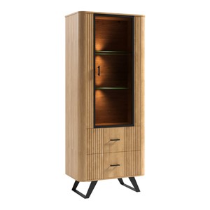
Solid Wood Display Cabinet Natural 70 x 39.7 x H. 170 cm

Grouping and Rhythm: The Order of Things

A successful display cabinet follows an inner rhythm. Objects are not distributed randomly but organized in groups connected by form, color, or origin. Three vases of different heights form a unit, a pair of goblets frames a central bowl. Odd numbers create tension, even numbers symmetry. Both have their justification, depending on whether the room is designed for calm or dynamism.

Height differences create depth. Small pedestals made of acrylic or wood elevate individual pieces without disturbing the view. Flat objects such as plates or medals lean against the back wall, tall vessels stand at the front. This creates a staggered arrangement that prevents forms from overlapping. Space remains between the groups, room to breathe. An overloaded display cabinet tires the eye, one too empty appears lost.

Color and Material: Harmony Through Restraint

The back panel of a display cabinet is not a neutral background but an active part of the staging. Velvet in dark blue or burgundy makes gold and silver shine, emphasizes warm tones. Light linen or silk creates distance, cools down, suits modern ceramics or Scandinavian porcelain. Those who wish to forgo color choose mirrors: they double the collection, create depth, but require precise arrangement, as every object becomes visible from two sides.

The Decorations within the display cabinet also follows clear rules. Less is more. A single eucalyptus branch, a dried hydrangea, a narrow silk ribbon suffice to set accents. Seasonal elements bring variety without dominating the collection. In autumn a branch with rose hips, in winter a silver cone. Everything added must subordinate itself.

Solid Wood Display Cabinet Grey 70 x 39.7 x H. 170 cm

Lighting: Light as Silent Director

Without light, a display cabinet remains mute. Daylight alone is rarely sufficient, as it moves, casts shadows, fades under cloudy skies. Integrated LED strips at the top edge or on the sides provide even illumination. Warm white light emphasizes red tones and gold, cool white light makes crystal and silver appear clearer. Dimmable systems allow the intensity to be adjusted to the time of day.

Spotlights stage individual objects, create drama. They are suitable for special pieces that stand out from the collection: an antique vase, a signed glass, a rare figurine. But caution: too many light sources create restlessness, make the display cabinet look like a sales counter. Two to three targeted accents suffice.

Rules for Arrangement: Concrete Principles

  • Heavy objects at the bottom, light ones at the top: crystal bowls and bronze figures belong in the lower compartments, delicate porcelain and glasses at the top.
  • Color gradients create harmony: arrange objects from light to dark or in gradations of a color family, for example from cream through beige to brown.
  • Symmetry for classical rooms, asymmetry for modern ones: in a period building with double doors, a centrally aligned display cabinet appears harmonious; in a loft, the arrangement may be freer.
  • Plan for empty surfaces: every shelf needs space without objects, at least one third should remain free.
  • Rotation instead of stagnation: exchange individual pieces every few months, bring objects from storage to the front, let others rest.
Luxury Baroque Display Cabinet Grey / Gold 173 x 50 x H. 213 cm

The Display Cabinet in the Room: Location and Environment

A display cabinet does not stand in isolation. It enters into dialogue with the furniture around it, with the wall color, with pictures and textiles. In a dining room it forms the counterweight to the table, in a living room the calm pole opposite the seating area. The distance from the wall should be sufficient to clean the back, but not so large that the furniture appears lost. Fifteen to twenty centimeters suffice.

Those who own several display cabinets do not place them side by side but distribute them in the room or in different rooms. This creates not a museum-like impression but a natural presence. The proximity to other furniture also requires consideration: Commodes with closed fronts form a calm contrast to the transparent surfaces of a display cabinet, create balance between concealing and showing.

Care and Presence: Keeping the Collection Alive

A display cabinet demands attention. Dust settles on glass and porcelain, fingerprints cloud the panes. Regular cleaning is part of it, preferably with microfiber cloths and mild cleaners. Sensitive surfaces such as gilded edges or mother-of-pearl require special agents that protect the material.

But care means more than cleaning. It is about knowing the collection, preserving its stories, consciously integrating new pieces. Those who fill a display cabinet curate. They decide what becomes visible and what remains hidden, create order and meaning. Casa Padrino understands this interplay of furniture and content, offers display cabinets that not only function but lend dignity to the objects within.

What Defines a Display Cabinet: Order, Light, and Respect

In the end, it is the clarity that sustains a display cabinet. Not the quantity of objects decides, but the care of their arrangement. Every piece needs space, every ensemble a rhythm, every group a theme. Light directs the gaze, color creates atmosphere, emptiness gives things weight. Those who observe these principles transform a collection into an image that inscribes itself into the room and remains.

Related categories: Sofas, Mirrors, Garden Fountains. The full range: Baroque Furniture.