
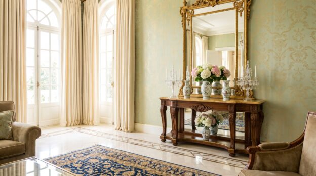
Light falls through tall windows and strikes a gilded frame moulding, the brass handle of a chest of drawers, the narrow strip of a table edge. Gold reflects, refracts, casts warm shadows. It can make a room elegant or overload it, depending on how much is at play and where it sits. The question is not whether gold fits, but how much lustre the architecture can bear before the room loses its calm.
Those who work with gold work with light. The material draws the eye, sets accents, directs attention. In the right dose, it lends an interior depth and warmth. Too much of it tips the effect: the room appears restless, surfaces compete, proportions blur. It requires a sense of measure and distribution for gold to unfold its elegance rather than obscure it.
Gold as accent, not as surface
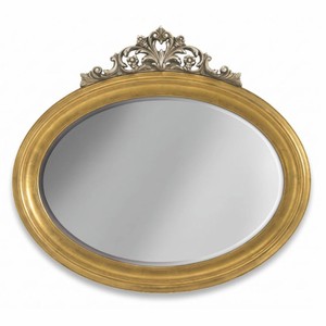
Gold works best when used selectively. A gilded picture frame above the fireplace, a candlestick on the sideboard, a narrow border on the edge of a mirror: that suffices to show presence. Large gilded surfaces, however, such as a completely golden wall or a solid coffee table with gold leaf application, dominate the room and leave little scope for other materials. Those who choose Mirrors with gilded frames rely on a classic device that multiplies light without being intrusive. The frame contains the reflection, gives it structure, whilst the gold intensifies the lustre but does not take over.
From the Casa Padrino collection
Material mix: gold requires contrast
Gold only unfolds its effect in interplay with other surfaces. Velvet, linen, dark wood, marble: these materials create the necessary contrast so that gold does not stand isolated. A velvet sofa in anthracite or dark green takes the edge off the lustre, a wooden table with a matt surface grounds the reflection. Marble too, whether white or black veined, forms a calm base on which golden details come into their own without dominating. At Casa Padrino you will find Consoles with gilded legs and marble tops that embody precisely this balance: the gold carries the structure, the stone provides weight and calm.
Colour temperature: warm gold, cool surroundings
Gold has a warm colour temperature that stands out particularly well against cool tones. Grey, blue, black, also cool white: these colours make gold shine without appearing garish. In a room with warm earth tones, beige or terracotta, gold can lose its contour because the colour temperatures lie too close together. Those who design a room with much grey or anthracite can add warmth with golden accents without breaking the cool elegance. A golden candlestick on a grey console, a gilded table lamp beside an anthracite armchair: these are combinations that create tension without becoming restless.
Distribution in the room: rhythm instead of accumulation
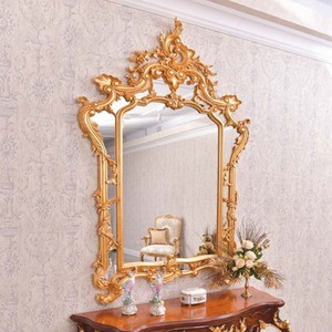
Gold should be distributed in the room, not concentrated. If all golden elements stand on one side, an imbalance arises. It is better to scatter the accents: a mirror on one wall, a lamp on the opposite side, a small tray on the side table. This creates a rhythm that guides the eye through the room without holding it. Height also plays a role: golden details at different levels, from floor to ceiling, create depth and make the room appear larger. A tall floor lamp, a medium-height chest of drawers with brass handles, a low stool with golden feet: this gradation gives the room structure.
Surface: matt, polished or brushed
Not every gold shines the same. Polished gold reflects strongly, appears luminous and present. Matt or brushed gold, however, is more restrained, almost silk-matt, and integrates more easily into calm interiors. In a room with much daylight, polished gold can quickly become too dominant because it multiplies the light. Here matt gold is advisable, which radiates warmth without dazzling. In darker rooms, however, such as a study with little window area, polished gold can help create brightness and visually open the room. Casa Padrino offers a wide selection of Decorations with different gold surfaces, from high-gloss polished to gently brushed brass, so that the suitable variant can be found for every room atmosphere.
Dosage according to room size
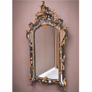
In small rooms, gold appears overloaded more quickly than in large ones. A compact guest bathroom perhaps tolerates a gilded tap and a narrow mirror with gold frame, no more. In a spacious living room with high ceilings, however, a larger pendant lamp with brass shade may also be appropriate, plus a side table with golden legs and a few smaller accessories. The room size determines how much lustre is possible without the proportions falling out of balance. A rule of thumb: the smaller the room, the more delicate the golden elements should be.
Combination rules for beginners
- Maximum three to five golden objects per room, distributed across different areas
- Combine gold with matt surfaces: velvet, linen, untreated wood
- Choose cool base colours: grey, anthracite, dark blue, black
- Use different heights: floor, table height, eye level, ceiling
- Matt gold in bright rooms, polished gold in darker rooms
What carries the room
Gold is a material that demands attention. It requires restraint, clear lines and conscious distribution for it to unfold its elegance. Those who understand it as an accent, not as a surface, who combine it with calm materials and keep the colour temperature in view, create rooms that radiate warmth and nobility without appearing overloaded. The dose makes the difference: a room tolerates as much lustre as it has calm to carry it.
Related categories: Beds, Flower Pots, Fountains and Water Columns. The full range: Baroque Furniture.